PerformanceAnalytics Charts and Tables Overview
Peter Carl & Brian G. Peterson
2018-04-05
Abstract
This vignette gives a brief overview of (some of) the graphics and display wrapper functionality contained in including most of the charts and tables . For a more complete overview of the package’s functionality and extensibility see the manual pages. We develop the examples using data for six (hypothetical) managers, a peer index, and an asset class index.
Introduction
PerformanceAnalytics is a library of functions designed for evaluating the performance and risk characteristics of financial assets or funds. In particular, we have focused on functions that have appeared in the academic literature over the past several years, but had no functional equivalent in R.
Our goal for PerformanceAnalytics is to make it simple for someone to ask and answer questions about performance and risk as part of a broader investment decision-making process. There is no magic bullet here – there won’t be one right answer delivered in these metrics and charts. Investments must be made in context of investment objectives. But what this library aspires to do is help the decision-maker accrete evidence organized to answer a specific question that is pertinent to the decision at hand. Our hope is that using such tools to uncover information and ask better questions will, in turn, create a more informed investor and help them ask better quality decisions.
This vignette provides a demonstration of some of the capabilities of PerformanceAnalytics. We focus on the graphs and tables, but comment on some other metrics along the way. These examples are not intended to be complete, but they should provide an indication of the kinds of analysis that can be done. Other examples are available in the help pages of the functions described in the main page of PerformanceAnalytics.
Set up PerformanceAnalytics
These examples assume the reader has basic knowledge of R and understands how to install R, read and manipulate data, and create basic calculations. For further assistance, please see http://cran.r-project.org/doc/manuals/R-intro.pdf and other available materials at http://cran.r-project.org. This section will begin with installation, discuss the example data set, and provide an overview of charts attributes that will be used in the examples that follow.
Install PerformanceAnalytics
As of version 0.9.4, PerformanceAnalytics is available via CRAN, but you will need version 0.9.5 or later to replicate the examples that follow. R users with connectivity can simply type: install.packages("PerformanceAnalytics"). Or, if you already have an earlier version installed, see update.packages. A number of packages are required, including Hmisc, zoo, and the various Rmetrics packages such as fBasics, fCalendar, and fExtremes. After installing PerformanceAnalytics, load it into your active R session using library("PerformanceAnalytics").
Load and review data
data(managers)
head(managers)| HAM1 | HAM2 | HAM3 | HAM4 | HAM5 | HAM6 | EDHEC.LS.EQ | SP500.TR | US.10Y.TR | US.3m.TR | |
|---|---|---|---|---|---|---|---|---|---|---|
| 1996-01-31 | 0.0074 | NA | 0.0349 | 0.0222 | NA | NA | NA | 0.0340 | 0.00380 | 0.00456 |
| 1996-02-29 | 0.0193 | NA | 0.0351 | 0.0195 | NA | NA | NA | 0.0093 | -0.03532 | 0.00398 |
| 1996-03-31 | 0.0155 | NA | 0.0258 | -0.0098 | NA | NA | NA | 0.0096 | -0.01057 | 0.00371 |
| 1996-04-30 | -0.0091 | NA | 0.0449 | 0.0236 | NA | NA | NA | 0.0147 | -0.01739 | 0.00428 |
| 1996-05-31 | 0.0076 | NA | 0.0353 | 0.0028 | NA | NA | NA | 0.0258 | -0.00543 | 0.00443 |
| 1996-06-30 | -0.0039 | NA | -0.0303 | -0.0019 | NA | NA | NA | 0.0038 | 0.01507 | 0.00412 |
First we load the data used in all of the examples that follow. As you can see, managers is a data frame that contains columns of monthly returns for six hypothetical asset managers (HAM1 through HAM6), the EDHEC Long-Short Equity hedge fund index, the S&P 500 total returns, and total return series for the US Treasury 10-year bond and 3-month bill. Monthly returns for all series end in December 2006 and begin at different periods starting from January 1996. Similar data could be constructed using mymanagers=read.csv("/path/to/file/mymanagers.csv", row.names=1), where the first column contains dates in the YYYY-MM-DD format.
A quick sidenote: this library is applicable to return (rather than price) data, and has been tested mostly on a monthly scale. Many library functions will work with regular data at different scales (e.g., daily, weekly, etc.) or irregular return data as well. See function CalculateReturns for calculating returns from prices, and be aware that the zoo library’s aggregate function has methods for tseries and zoo timeseries data classes to rationally coerce irregular data into regular data of the correct periodicity.
With the data object in hand, we group together columns of interest make the examples easier to follow. As shown in Figure Assess-and-Organize, we first confirm the dimensions of the object and the overall length of the timeseries.
dim(managers)## [1] 132 10managers.length = dim(managers)[1]
colnames(managers)## [1] "HAM1" "HAM2" "HAM3" "HAM4" "HAM5"
## [6] "HAM6" "EDHEC LS EQ" "SP500 TR" "US 10Y TR" "US 3m TR"manager.col = 1
peers.cols = c(2,3,4,5,6)
indexes.cols = c(7,8)
Rf.col = 10
#factors.cols = NA
trailing12.rows = ((managers.length - 11):managers.length)
trailing12.rows## [1] 121 122 123 124 125 126 127 128 129 130 131 132trailing36.rows = ((managers.length - 35):managers.length)
trailing60.rows = ((managers.length - 59):managers.length)
#assume contiguous NAs - this may not be the way to do it na.contiguous()?
frInception.rows = (length(managers[,1]) - length(managers[,1][!is.na(managers[,1])]) + 1):length(managers[,1])Next, we group the columns together. The first column, HAM1, contains the subject of our analysis in the examples below. Columns two through six contain returns of other managers using a similar investing style that might be considered substitutes – a peer group, of sorts. Columns seven and eight contain key indexes. The EDHEC Long/Short Equity index is a peer index, and the S&P 500 Total Return index is an asset-class index. We combine those into a set of indexes for later analysis. Column nine we skip for the time being; column 10 we use as the risk free rate for each month.
Then we do the same thing for the rows of interest. We calculate the row numbers that represent different trailing periods and keep those handy for doing comparative analyses.
Create charts and tables for presentation
Graphs and charts help to organize information visually. Our goals in creating these functions were to simplify the process of creating well-formatted charts that are frequently used for portfolio analysis and to create print-quality graphics that may be used in documents for broader consumption. R’s graphics capabilities are substantial, but the simplicity of the output of R’s default graphics functions such as plot does not always compare well against graphics delivered with commercial asset or portfolio analysis software from places such as MorningStar or PerTrac.
Color Palettes
We have set up some specific color palattes designed to create readable line and bar graphs with specific objectives. We use this approach (rather than generating them on the fly) for two reasons: first, there are fewer dependencies on libraries that don’t need to be called dynamically; and second, to guarantee the color used for the n-th column of data. Figure Examples-of-Color shows some examples of the different palates.
The first category of colorsets are designed to provide focus to the data graphed as the first element, and include redfocus, bluefocus, and greenfocus. These palettes are best used when there is an important data set for the viewer to focus on. The other data provide some context, so they are graphed in diminishing values of gray. These were generated with RColorBrewer, using the 8 level “grays” palette and replacing the darkest gray with the focus color. To coordinate these colorsets with the equal-weighted colors below, replace the highlight color with the first color of the equal weighted palette from below. This will coordinate charts with different purposes.
The second category is sets of equal-weighted colors. These colorsets are useful for when all of the data should be observed and distinguishable on a line graph. The different numbers in the name indicate the number of colors generated (six colors is probably the maximum for a readable linegraph, but we provide as many as twelve). Examples include rainbow12equal through rainbow4equal, in steps of two. These colorsets were generated with rainbow(12, s = 0.6, v = 0.75). The rich12equal and other corresponding colorsets were generated with with package gplots function rich.colors(12). Similarly tim12equal and similar colorsets were generated with with package fields function tim.colors(12), a function said to emulate the Matlab colorset. The dark8equal, dark6equal, set8equal, and set6equal colorsets were created with package RColorBrewer, e.g., brewer.pal(8,"Dark2"). A third category is a set of monochrome colorsets, including greenmono , bluemono, redmono, and gray8mono and gray6mono.
To see what these lists contain, just type the name.
tim12equal## [1] "#00008F" "#0000EA" "#0047FF" "#00A2FF" "#00FEFF" "#5AFFA5" "#B5FF4A"
## [8] "#FFED00" "#FF9200" "#FF3700" "#DB0000" "#800000"These are just lists of strings that contain the RGB codes of each color. You can easily create your own if you have a particular palate that you like to use. Alternatively, you can use the R default colors. For more information, see this color chart.
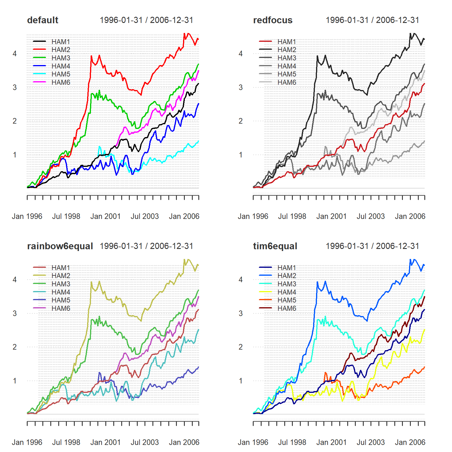
Examples of Color Palettes
Symbols
Similarly, there are a few sets of grouped symbols for scatter charts . These include opensymbols, closedsymbols, fillsymbol, linesymbols, and allsymbols.
Legend locations
In the single charts the legend can be moved around on the plot. There are nine locations that can be specified by keyword: “bottomright”, “bottom”, “bottomleft”, “left”, “topleft”, “top”, “topright”, “right” and “center”. This places the legend on the inside of the plot frame at the given location. Further information can be found in xy.coord. Most compound charts have fixed legend locations.
Other Parameters
We have tried to leave access to all of the extensive list of parameters available in ’s traditional graphics. For more information, see plot.default and par. In the example above, we passed lwd the value of 2, which affects the line width. We might also alter the line type or other parameter.
Create Charts and Tables
With that, we are ready to analyze the sample data set. This section starts with a set of charts that provide a performance overview, some tables for presenting the data and basic statistics, and then discusses ways to compare distributions, relative performance, and downside risk.
Create performance charts
charts.PerformanceSummary(
  managers[,c(manager.col,indexes.cols)],
  colorset=rich6equal,
  lwd=2,
  ylog=TRUE
)
Draw a Performance Summary Chart
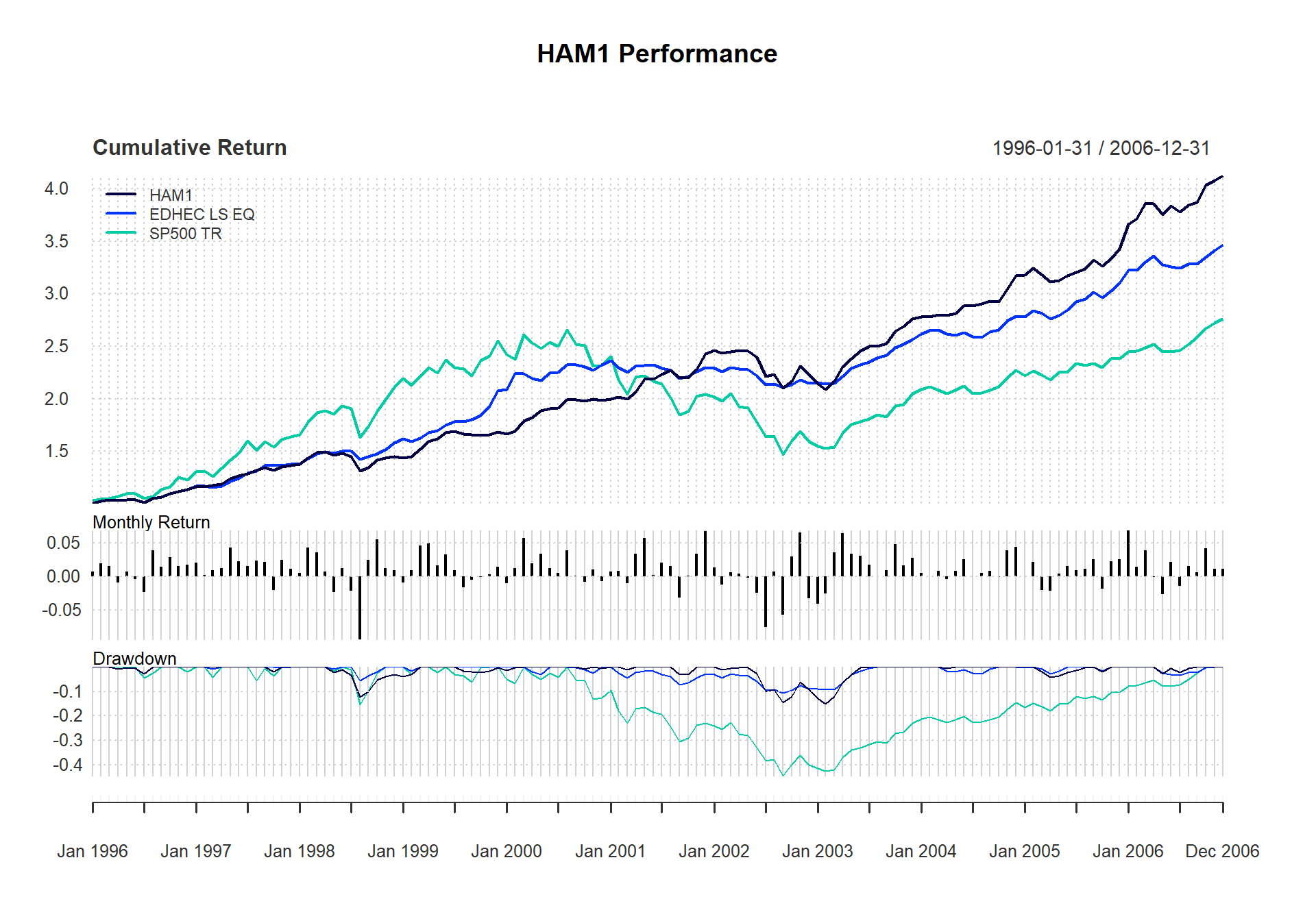
Figure shows a three-panel performance summary chart and the code used to generate it. The top chart is a normal cumulative return or wealth index chart that shows the cumulative returns through time for each column. For data with later starting times, set the parameter begin = "axis", which starts the wealth index of all columns at 1, or begin = "first", which starts the wealth index of each column at the wealth index value attained by the first column of data specified. The second of these settings, which is the default, allows the reader to see how the two indexes would compare had they started at the same time regardless of the starting period. In addition, the y-axis can be set to a logarithmic value so that growth can be compared over long periods. This chart can be generated independently using chart.CumReturns.
The second chart shows the individual monthly returns overlaid with a rolling measure of tail risk referred to as Cornish Fisher Value-at-Risk (VaR) or Modified VaR. Alternative risk measures, including standard deviation (specified as StdDev) and traditional Value-at-Risk (VaR), can be specified using the method} parameter. Note thatStdDev} and VaR are symmetric calculations, so a high and low measure will be plotted. ModifiedVaR, on the other hand, is asymmetric and only a lower bound is drawn. These risk calculations are made on a rolling basis from inception, or can be calculated on a rolling window by setting width to a value of the number of periods. These calculations should help the reader to identify events or periods when estimates of tail risk may have changed suddenly, or to help evaluate whether the assumptions underlying the calculation seem to hold . The risk calculations can be generated for all of the columns provided by using the all} parameter. When set toTRUE}, the function calculates risk lines for each column given and may help the reader assess relative risk levels through time. This chart can be generated using chart.BarVaR.
The third chart in the series is a drawdown or underwater chart, which shows the level of losses from the last value of peak equity attained. Any time the cumulative returns dips below the maximum cumulative returns, it’s a drawdown. This chart helps the reader assess the synchronicity of the loss periods and their comparative severity. As you might expect, this chart can also be created using chart.Drawdown.
Create a monthly returns table
Summary statistics are then the necessary aggregation and reduction of (potentially thousands) of periodic return numbers. Usually these statistics are most palatable when organized into a table of related statistics, assembled for a particular purpose. A common offering of past returns organized by month and accumulated by calendar year is usually presented as a table, such as in table.CalendarReturns.
t(table.CalendarReturns(managers[,c(manager.col,indexes.cols)]))## 1996 1997 1998 1999 2000 2001 2002 2003 2004 2005 2006
## Jan 0.7 2.1 0.6 -0.9 -1.0 0.8 1.4 -4.1 0.5 0.0 6.9
## Feb 1.9 0.2 4.3 0.9 1.2 0.8 -1.2 -2.5 0.0 2.1 1.5
## Mar 1.6 0.9 3.6 4.6 5.8 -1.1 0.6 3.6 0.9 -2.1 4.0
## Apr -0.9 1.3 0.8 5.1 2.0 3.5 0.5 6.5 -0.4 -2.1 -0.1
## May 0.8 4.4 -2.3 1.6 3.4 5.8 -0.2 3.4 0.8 0.4 -2.7
## Jun -0.4 2.3 1.2 3.3 1.2 0.2 -2.4 3.1 2.6 1.6 2.2
## Jul -2.3 1.5 -2.1 1.0 0.5 2.1 -7.5 1.8 0.0 0.9 -1.4
## Aug 4.0 2.4 -9.4 -1.7 3.9 1.6 0.8 0.0 0.5 1.1 1.6
## Sep 1.5 2.2 2.5 -0.4 0.1 -3.1 -5.8 0.9 0.9 2.6 0.7
## Oct 2.9 -2.1 5.6 -0.1 -0.8 0.1 3.0 4.8 -0.1 -1.9 4.3
## Nov 1.6 2.5 1.3 0.4 1.0 3.4 6.6 1.7 3.9 2.3 1.2
## Dec 1.8 1.1 1.0 1.5 -0.7 6.8 -3.2 2.8 4.4 2.6 1.1
## HAM1 13.6 20.4 6.1 16.1 17.7 22.4 -8.0 23.7 14.9 7.8 20.5
## EDHEC LS EQ NA 21.4 14.6 31.4 12.0 -1.2 -6.4 19.3 8.6 11.3 11.7
## SP500 TR 23.0 33.4 28.6 21.0 -9.1 -11.9 -22.1 28.7 10.9 4.9 15.8Figure shows a table of returns formatted with years in rows, months in columns, and a total column in the last column. For additional columns, the annual returns will be appended as columns. Adding benchmarks or peers alongside the annualized data is helpful for comparing returns across calendar years. Because there are a number of columns in the example, we make the output easier to read by using the t function to transpose the resulting data frame.
Calculate monthly statistics
Likewise, the monthly returns statistics table in Figure was created as a way to display a set of related measures together for comparison across a set of instruments or funds. In this example, we are looking at performance {}``from inception’’ for most of the managers, so careful consideration needs to be given to missing data or unequal time series when interpreting the results. Most people will prefer to see such statistics for common or similar periods. Each of the individual functions can be called individually, as well.
table.Stats(managers[,c(manager.col,peers.cols)])| HAM1 | HAM2 | HAM3 | HAM4 | HAM5 | HAM6 | |
|---|---|---|---|---|---|---|
| Observations | 132.0000 | 125.0000 | 132.0000 | 132.0000 | 77.0000 | 64.0000 |
| NAs | 0.0000 | 7.0000 | 0.0000 | 0.0000 | 55.0000 | 68.0000 |
| Minimum | -0.0944 | -0.0371 | -0.0718 | -0.1759 | -0.1320 | -0.0404 |
| Quartile 1 | 0.0000 | -0.0098 | -0.0054 | -0.0198 | -0.0164 | -0.0016 |
| Median | 0.0112 | 0.0082 | 0.0102 | 0.0138 | 0.0038 | 0.0128 |
| Arithmetic Mean | 0.0111 | 0.0141 | 0.0124 | 0.0110 | 0.0041 | 0.0111 |
| Geometric Mean | 0.0108 | 0.0135 | 0.0118 | 0.0096 | 0.0031 | 0.0108 |
| Quartile 3 | 0.0248 | 0.0252 | 0.0314 | 0.0460 | 0.0309 | 0.0255 |
| Maximum | 0.0692 | 0.1556 | 0.1796 | 0.1508 | 0.1747 | 0.0583 |
| SE Mean | 0.0022 | 0.0033 | 0.0032 | 0.0046 | 0.0052 | 0.0030 |
| LCL Mean (0.95) | 0.0067 | 0.0076 | 0.0062 | 0.0019 | -0.0063 | 0.0051 |
| UCL Mean (0.95) | 0.0155 | 0.0206 | 0.0187 | 0.0202 | 0.0145 | 0.0170 |
| Variance | 0.0007 | 0.0013 | 0.0013 | 0.0028 | 0.0021 | 0.0006 |
| Stdev | 0.0256 | 0.0367 | 0.0365 | 0.0532 | 0.0457 | 0.0238 |
| Skewness | -0.6588 | 1.4580 | 0.7908 | -0.4311 | 0.0738 | -0.2800 |
| Kurtosis | 2.3616 | 2.3794 | 2.6829 | 0.8632 | 2.3143 | -0.3489 |
When we started this project, we debated whether or not such tables would be broadly useful or not. No reader is likely to think that we captured the precise statistics to help their decision. We merely offer these as a starting point for creating your own. Add, subtract, do whatever seems useful to you. If you think that your work may be useful to others, please consider sharing it so that we may include it in a future version of this library.
Compare distributions
For distributional analysis, a few graphics may be useful. The result of chart.Boxplot, shown in Figure , is an example of a graphic that is difficult to create in Excel and is under-utilized as a result. A boxplot of returns is, however, a very useful way to observe the shape of large collections of asset returns in a manner that makes them easy to compare to one another.
chart.Boxplot(
  managers[ trailing36.rows, c(manager.col, peers.cols, indexes.cols)],
  main = "Trailing 36-Month Returns"
)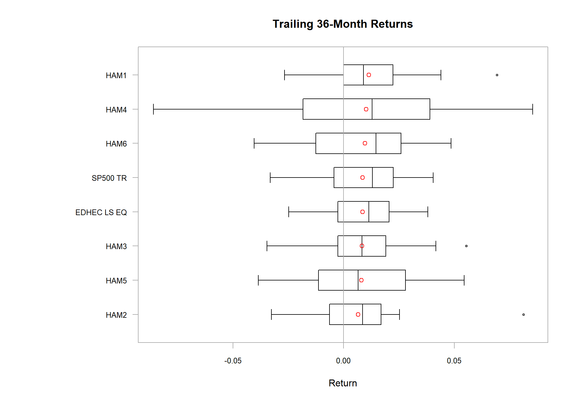
Create a Boxplot
It is often valuable when evaluating an investment to know whether the instrument that you are examining follows a normal distribution. One of the first methods to determine how close the asset is to a normal or log-normal distribution is to visually look at your data. Both chart.QQPlot and chart.Histogram will quickly give you a feel for whether or not you are looking at a normally distributed return history. Figure shows a histogram generated for HAM1 with different display options.
layout(rbind(c(1,2),c(3,4)))
chart.Histogram(managers[,1,drop=F], main = "Plain", methods = NULL)
chart.Histogram(managers[,1,drop=F], main = "Density", breaks=40,
methods = c("add.density", "add.normal"))
chart.Histogram(managers[,1,drop=F], main = "Skew and Kurt", methods = c
("add.centered", "add.rug"))
chart.Histogram(managers[,1,drop=F], main = "Risk Measures", methods = c
("add.risk"))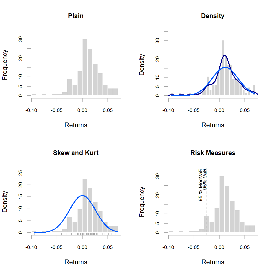
Create a Histogram of Returns
Look back at the results generated by table.Stats. Differences between var and SemiVariance will help you identify fBasics::skewness in the returns. Skewness measures the degree of asymmetry in the return distribution. Positive skewness indicates that more of the returns are positive, negative skewness indicates that more of the returns are negative. An investor should in most cases prefer a positively skewed asset to a similar (style, industry, region) asset that has a negative skewness. Kurtosis measures the concentration of the returns in any given part of the distribution (as you should see visually in a histogram). The fBasics::kurtosis function will by default return what is referred to as “excess kurtosis”, where zero is a normal distribution, other methods of calculating kurtosis than method="excess" will set the normal distribution at a value of 3. In general a rational investor should prefer an asset with a low to negative excess kurtosis, as this will indicate more predictable returns. If you find yourself needing to analyze the distribution of complex or non-smooth asset distributions, the nortest package has several advanced statistical tests for analyzing the normality of a distribution.
Show relative return and risk
Returns and risk may be annualized as a way to simplify comparison over longer time periods. Although it requires a bit of estimating, such aggregation is popular because it offers a reference point for easy comparison, such as in Figure . Examples are in Return.annualized, StdDev.annualized, and SharpeRatio.annualized.
chart.RiskReturnScatter(managers[trailing36.rows,1:8], Rf=.03/12, main = "Trailing 36-Month Performance", colorset=c("red", rep("black",5), "orange", "green"))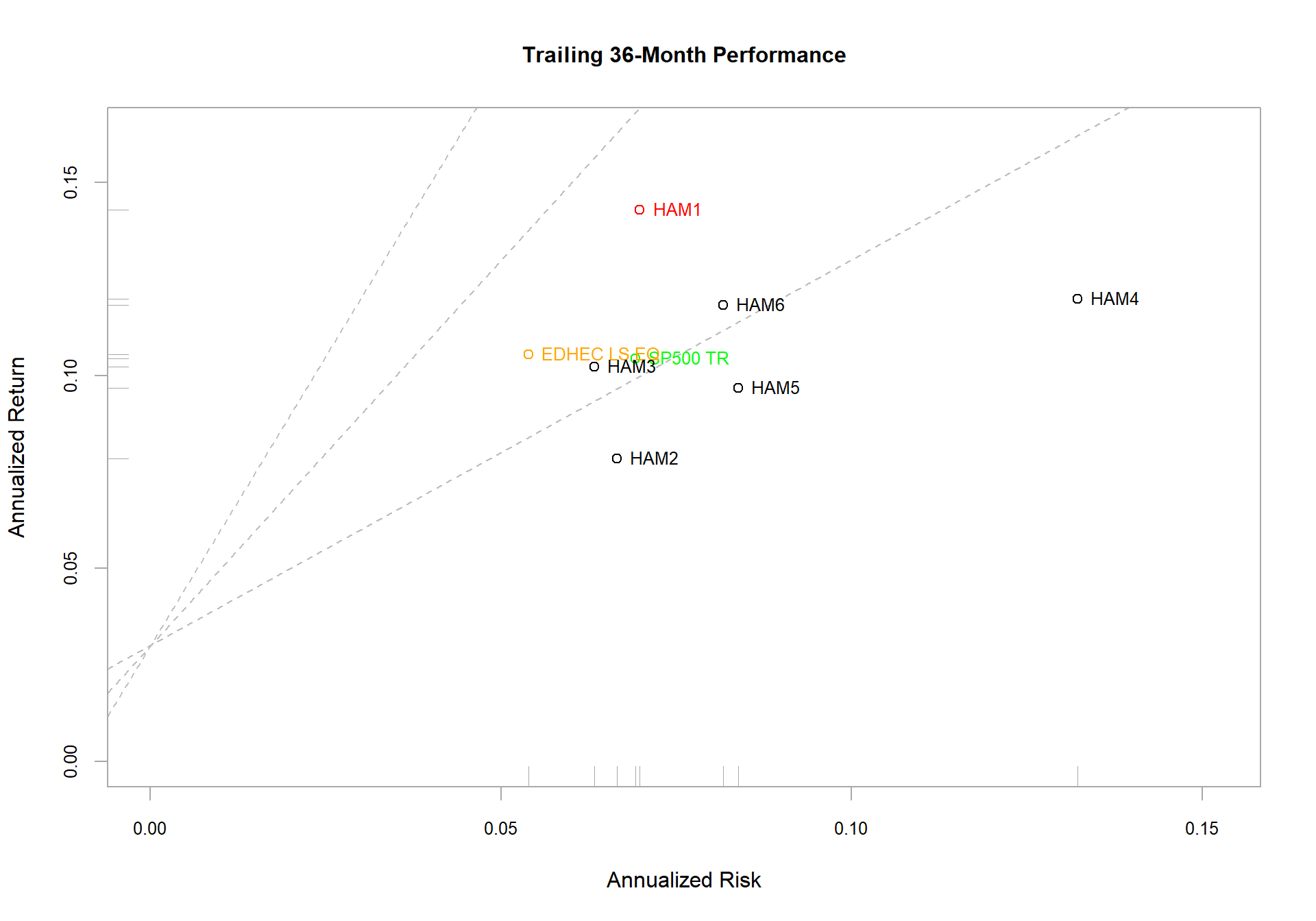
Show Relative Risk and Return
chart.Scatter is a utility scatter chart with some additional attributes that are used in chart.RiskReturnScatter. Different risk parameters may be used. The parameter method may be any of modVaR, VaR, or StdDev.
Additional information can be overlaid, as well. If add.sharpe is set to a value, say c(1,2,3), the function overlays Sharpe ratio line that indicates Sharpe ratio levels of one through three. Lines are drawn with a y-intercept of the risk free rate (rf) and the slope of the appropriate Sharpe ratio level. Lines should be removed where not appropriate (e.g., sharpe.ratio = NULL). With a large number of assets (or columns), the names may get in the way. To remove them, set add.names = NULL. A box plot may be added to the margins to help identify the relative performance quartile by setting add.boxplots = TRUE.
Examine performance consistency
Rolling performance is typically used as a way to assess stability of a return stream. Although perhaps it doesn’t get much credence in the financial literature because of it’s roots in digital signal processing, many practitioners find rolling performance to be a useful way to examine and segment performance and risk periods. See chart.RollingPerformance, which is a way to display different metrics over rolling time periods.
Figure shows three panels, the first for rolling returns, the second for rolling standard deviation, and the third for rolling Sharpe ratio. These three panels each call chart.RollingPerformance with a different FUN argument, allowing any function to be viewed over a rolling window.
charts.RollingPerformance(managers[, c(manager.col, peers.cols, indexes.cols)], Rf=.03/12, colorset = c("red", rep("darkgray",5), "orange", "green"), lwd = 2)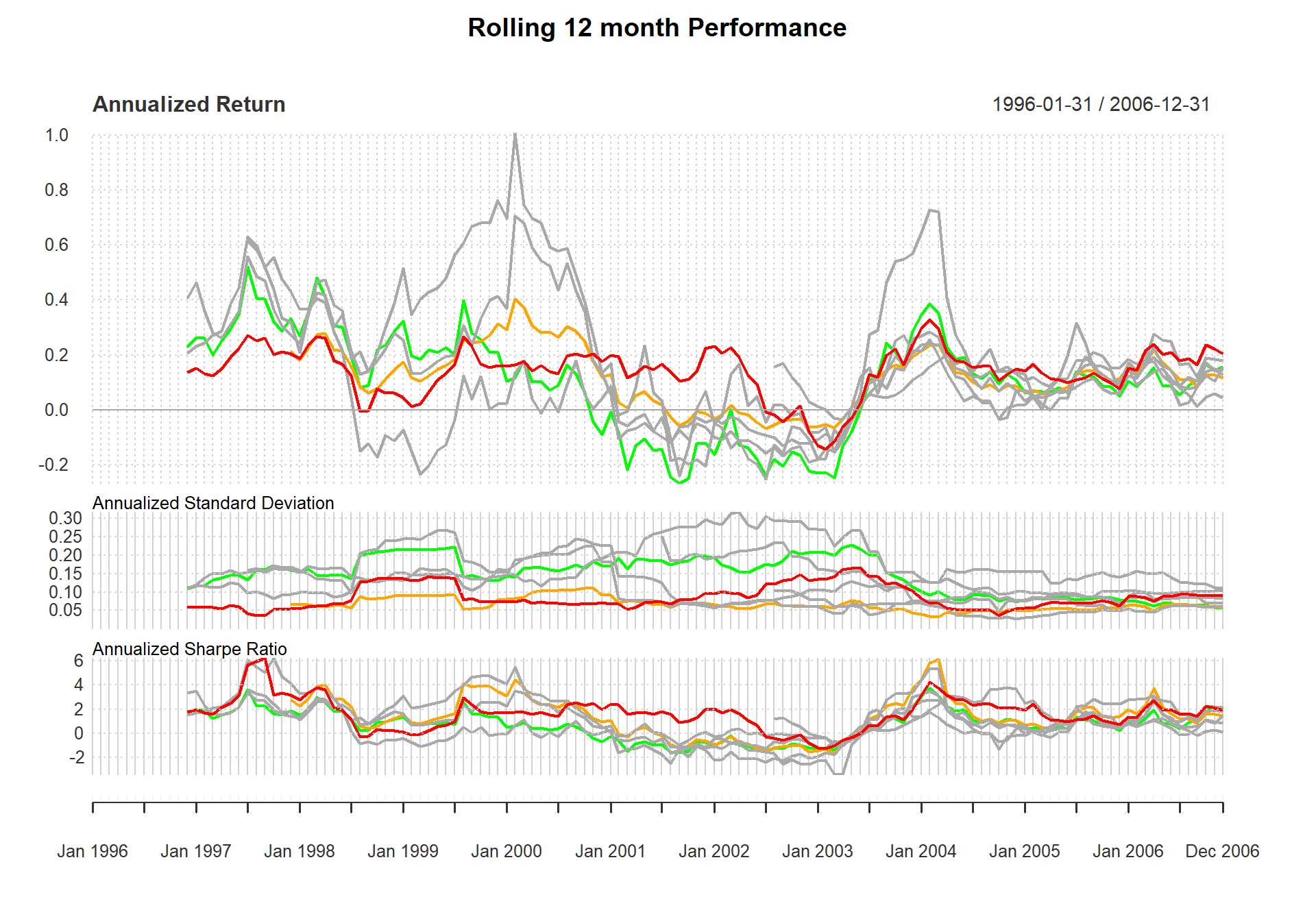
Examine Rolling Performance
Display relative performance
The function chart.RelativePerformance shows the ratio of the cumulative performance for two assets at each point in time and makes periods of under- or out-performance easy to see. The value of the chart is less important than the slope of the line. If the slope is positive, the first asset (numerator) is outperforming the second, and vice versa. Figure shows the returns of the manager in question relative to each member of the peer group and the peer group index.
chart.RelativePerformance(managers[ , manager.col, drop = FALSE], managers[ , c(peers.cols, 7)], colorset = tim8equal[-1], lwd = 2, legend.loc = "topleft")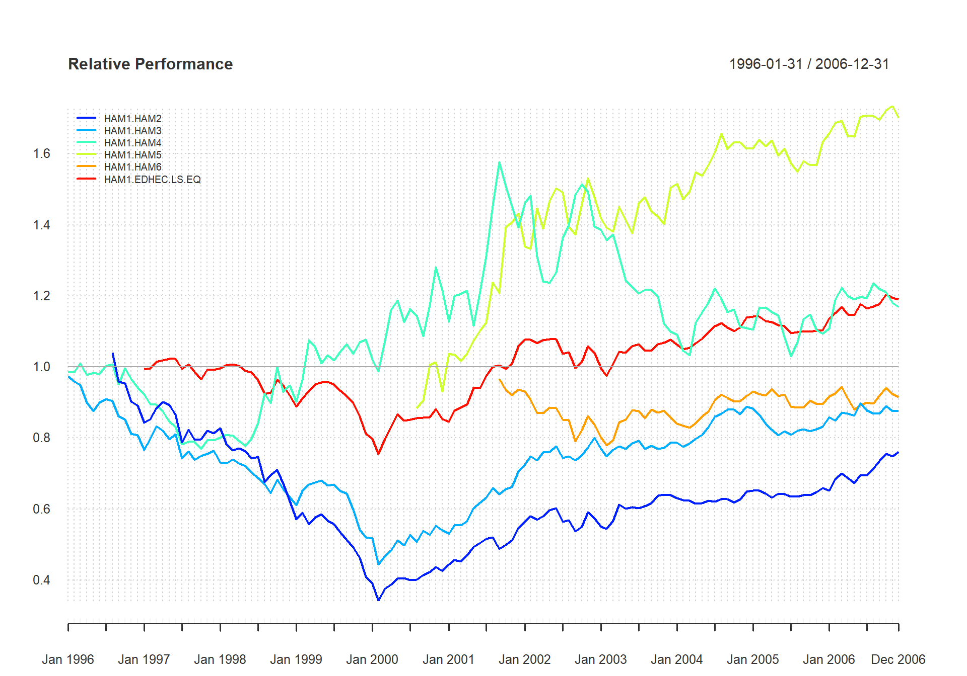
Examine Relative Performance of Assets
Looking at the data another way, we use the same chart to assess the peers individually against the asset class index. Figure shows the peer group members’ returns relative to the S&P 500. Several questions might arise: Who beats the S&P? Can they do it consistently? Are there cycles when they under-perform or outperform as a group? Which manager has outperformed the most?
chart.RelativePerformance(managers[ , c(manager.col, peers.cols) ], managers[, 8, drop=F], colorset = rainbow8equal, lwd = 2, legend.loc = "topleft")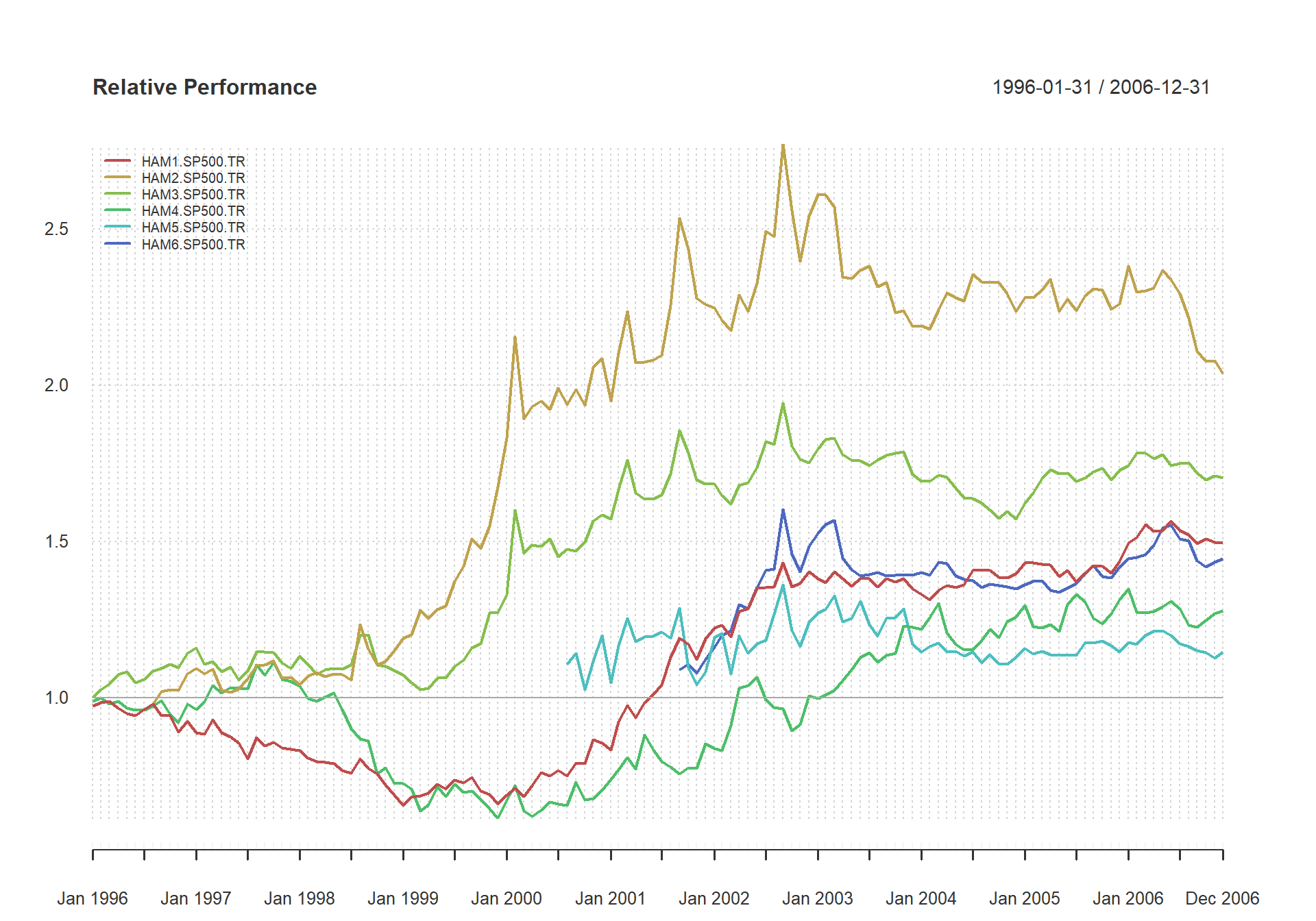
Examine Performance Relative to a Benchmark
Measure relative performance to a benchmark}
Identifying and using a benchmark can help us assess and explain how well we are meeting our investment objectives, in terms of a widely held substitute. A benchmark can help us explain how the portfolios are managed, assess the risk taken and the return desired, and check that the objectives were respected. Benchmarks are used to get better control of the investment management process and to suggest ways to improve selection.
Modern Portfolio Theory is a collection of tools and techniques by which a risk-averse investor may construct an optimal portfolio. It encompasses the Capital Asset Pricing Model (CAPM), the efficient market hypothesis, and all forms of quantitative portfolio construction and optimization. CAPM provides a justification for passive or index investing by positing that assets that are not on the efficient frontier will either rise or lower in price until they are on the efficient frontier of the market portfolio.
table.CAPM(managers[trailing36.rows, c(manager.col, peers.cols)],
managers[ trailing36.rows, 8, drop=FALSE],
Rf = managers[ trailing36.rows, Rf.col, drop=FALSE])| HAM1.to.SP500.TR | HAM2.to.SP500.TR | HAM3.to.SP500.TR | HAM4.to.SP500.TR | HAM5.to.SP500.TR | HAM6.to.SP500.TR | |
|---|---|---|---|---|---|---|
| Alpha | 0.0051 | 0.0020 | 0.0020 | 0.0009 | 0.0002 | 0.0022 |
| Beta | 0.6267 | 0.3223 | 0.6320 | 1.1282 | 0.8755 | 0.8150 |
| Beta+ | 0.8227 | 0.4176 | 0.8240 | 1.8430 | 1.0985 | 0.9993 |
| Beta- | 1.1218 | -0.0483 | 0.8291 | 1.2223 | 0.5283 | 1.1320 |
| R-squared | 0.3829 | 0.1073 | 0.4812 | 0.3444 | 0.5209 | 0.4757 |
| Annualized Alpha | 0.0631 | 0.0247 | 0.0243 | 0.0109 | 0.0030 | 0.0271 |
| Correlation | 0.6188 | 0.3276 | 0.6937 | 0.5868 | 0.7218 | 0.6897 |
| Correlation p-value | 0.0001 | 0.0511 | 0.0000 | 0.0002 | 0.0000 | 0.0000 |
| Tracking Error | 0.0604 | 0.0790 | 0.0517 | 0.1073 | 0.0583 | 0.0601 |
| Active Premium | 0.0384 | -0.0260 | -0.0022 | 0.0154 | -0.0077 | 0.0138 |
| Information Ratio | 0.6363 | -0.3295 | -0.0428 | 0.1433 | -0.1319 | 0.2296 |
| Treynor Ratio | 0.1741 | 0.1437 | 0.1101 | 0.0768 | 0.0734 | 0.1045 |
The performance premium provided by an investment over a passive strategy (the benchmark) is provided by ActivePremium, which is the investment’s annualized return minus the benchmark’s annualized return. A closely related measure is the TrackingError, which measures the unexplained portion of the investment’s performance relative to a benchmark. The InformationRatio of an Investment in a MPT or CAPM framework is the ActivePremium divided by the TrackingError. InformationRatio may be used to rank investments in a relative fashion.
The code in Figure creates a table of CAPM-related statistics that we can review and compare across managers. Note that we focus on the trailing-36 month period. There are, in addition to those listed, a wide variety of other CAPM-related metrics available. The CAPM.RiskPremium on an investment is the measure of how much the asset’s performance differs from the risk free rate. Negative Risk Premium generally indicates that the investment is a bad investment, and the money should be allocated to the risk free asset or to a different asset with a higher risk premium. CAPM.alpha is the degree to which the assets returns are not due to the return that could be captured from the market. Conversely, CAPM.beta describes the portions of the returns of the asset that could be directly attributed to the returns of a passive investment in the benchmark asset. The Capital Market Line CAPM.CML relates the excess expected return on an efficient market portfolio to its risk (represented in CAPM by StdDev). The slope of the CML, CAPM.CML.slope, is the Sharpe Ratio for the market portfolio. The Security Market Line is constructed by calculating the line of CAPM.RiskPremium over CAPM.beta. For the benchmark asset this will be 1 over the risk premium of the benchmark asset. The slope of the SML, primarily for plotting purposes, is given by CAPM.SML.slope. CAPM is a market equilibrium model or a general equilibrium theory of the relation of prices to risk, but it is usually applied to partial equilibrium portfolios which can create (sometimes serious) problems in valuation.
#source("chart.MultiScatter.R")
#chart.MultiScatter(Ra=managers[,1,drop=F],Rb=managers[,8,drop=F],linear.fit=T,Rf=managers[,10],excess.returns=T)
In a similar fashion to the rolling performance we displayed earlier, we can look at the stability of a linear model’s parameters through time. Figure shows a three panel chart for the alpha, beta, and r-squared measures through time across a rolling window. Each chart calls chart.RollingRegression with a different method parameter.
charts.RollingRegression(managers[, c(manager.col, peers.cols), drop = FALSE], managers[, 8, drop = FALSE], Rf = .03/12, colorset = redfocus, lwd = 2)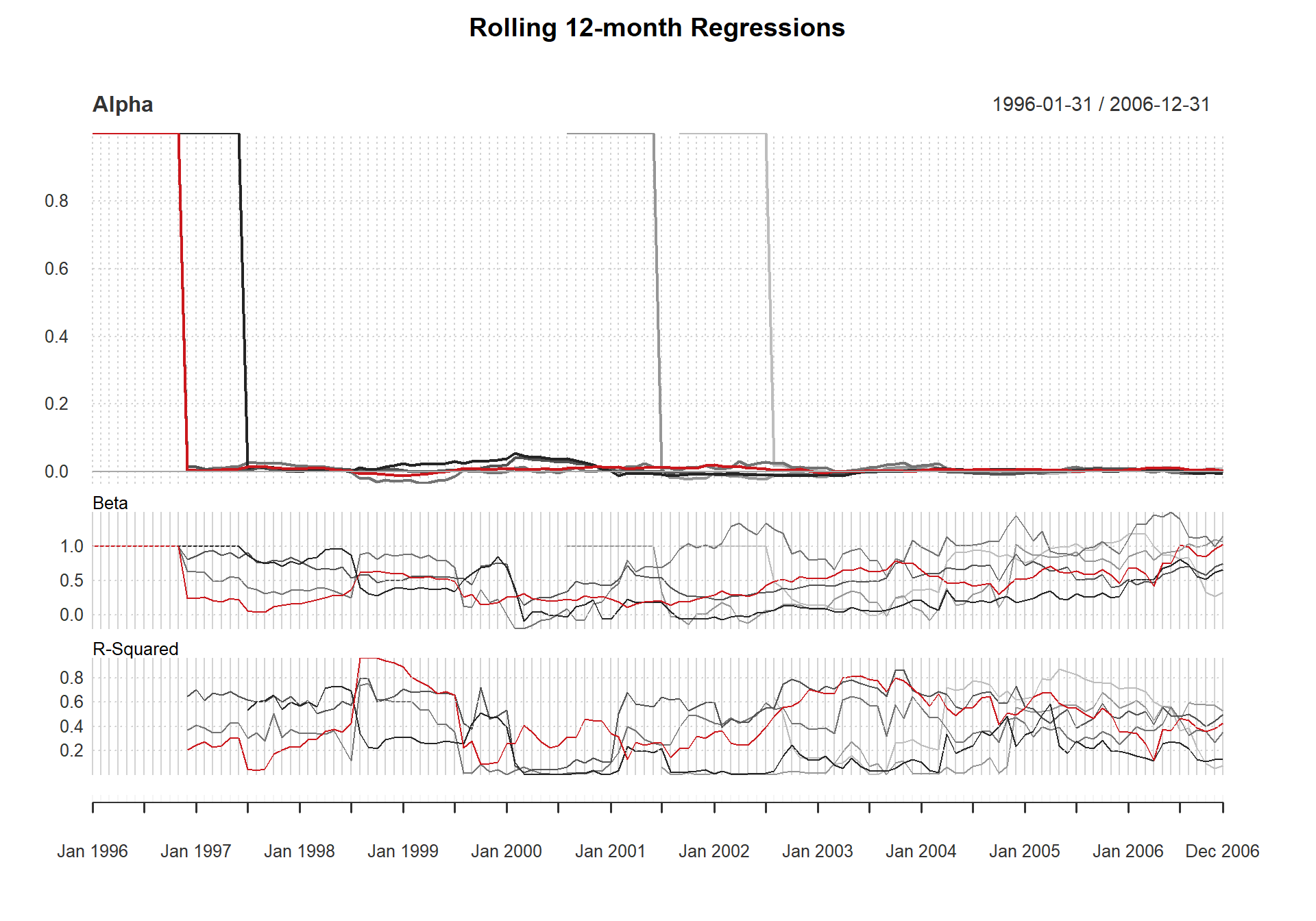
Create a Rolling Regression
Likewise, we can assess whether the correlation between two time series is constant through time. Figure shows the rolling 12-month correlation between each of the peer group and the S&P500. To look at the relationships over time and take a snapshot of the statistical relevance of the measure, use table.Correlation, as shown in Figure .
chart.RollingCorrelation(managers[,c(manager.col, peers.cols)], managers[, 8, drop = FALSE], colorset = tim8equal, lwd = 2, main = "12-Month Rolling Correlation")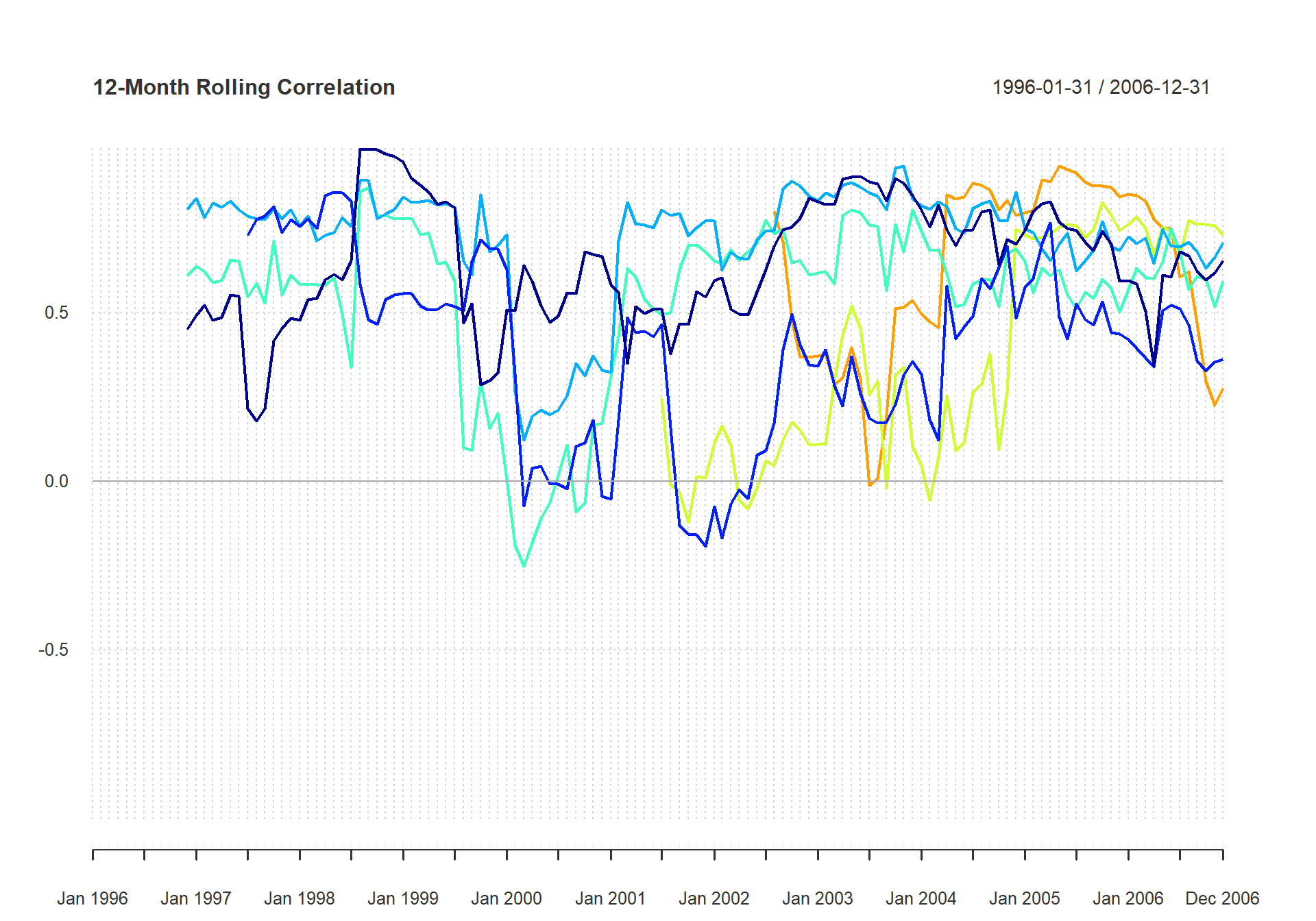
Chart the Rolling Correlation
table.Correlation(managers[, c(manager.col, peers.cols)], managers[, 8,
drop = F], legend.loc = "lowerleft")| Correlation | p.value | Lower.CI | Upper.CI | |
|---|---|---|---|---|
| HAM1 to SP500 TR | 0.6600671 | 0.0000000 | 0.5513838 | 0.7467191 |
| HAM2 to SP500 TR | 0.4128282 | 0.0000017 | 0.2557624 | 0.5486602 |
| HAM3 to SP500 TR | 0.6608633 | 0.0000000 | 0.5523659 | 0.7473433 |
| HAM4 to SP500 TR | 0.5601846 | 0.0000000 | 0.4305217 | 0.6671932 |
| HAM5 to SP500 TR | 0.2844487 | 0.0121683 | 0.0645846 | 0.4779755 |
| HAM6 to SP500 TR | 0.5091542 | 0.0000174 | 0.3010189 | 0.6709863 |
Calculate Downside Risk
Many assets, including hedge funds, commodities, options, and even most common stocks over a sufficiently long period, do not follow a normal distribution. For such common but non-normally distributed assets, a more sophisticated approach than standard deviation/volatility is required to adequately model the risk.
Markowitz, in his Nobel acceptance speech and in several papers, proposed that SemiVariance would be a better measure of risk than variance. This measure is also called SemiDeviation. The more general case of downside deviation is implemented in the function DownsideDeviation, as proposed by Sortino and Price (1994), where the minimum acceptable return (MAR) is a parameter to the function. It is interesting to note that variance and mean return can produce a smoothly elliptical efficient frontier for portfolio optimization utilizing quadprog::solve.QP or tseries::portfolio.optim or fPortfolio::MarkowitzPortfolio. Use of semivariance or many other risk measures will not necessarily create a smooth ellipse, causing significant additional difficulties for the portfolio manager trying to build an optimal portfolio. We’ll leave a more complete treatment and implementation of portfolio optimization techniques for another time.
\begin{center}
table.DownsideRisk(managers[,1:6],Rf=.03/12)| HAM1 | HAM2 | HAM3 | HAM4 | HAM5 | HAM6 | |
|---|---|---|---|---|---|---|
| Semi Deviation | 0.0191 | 0.0201 | 0.0237 | 0.0395 | 0.0324 | 0.0175 |
| Gain Deviation | 0.0169 | 0.0347 | 0.0290 | 0.0311 | 0.0313 | 0.0149 |
| Loss Deviation | 0.0211 | 0.0107 | 0.0191 | 0.0365 | 0.0324 | 0.0128 |
| Downside Deviation (MAR=10%) | 0.0178 | 0.0164 | 0.0214 | 0.0381 | 0.0347 | 0.0161 |
| Downside Deviation (Rf=3%) | 0.0154 | 0.0129 | 0.0185 | 0.0353 | 0.0316 | 0.0133 |
| Downside Deviation (0%) | 0.0145 | 0.0116 | 0.0174 | 0.0341 | 0.0304 | 0.0121 |
| Maximum Drawdown | 0.1518 | 0.2399 | 0.2894 | 0.2874 | 0.3405 | 0.0788 |
| Historical VaR (95%) | -0.0258 | -0.0294 | -0.0425 | -0.0799 | -0.0733 | -0.0341 |
| Historical ES (95%) | -0.0513 | -0.0331 | -0.0555 | -0.1122 | -0.1023 | -0.0392 |
| Modified VaR (95%) | -0.0342 | -0.0276 | -0.0368 | -0.0815 | -0.0676 | -0.0298 |
| Modified ES (95%) | -0.0610 | -0.0614 | -0.0440 | -0.1176 | -0.0974 | -0.0390 |
Another very widely used downside risk measures is analysis of drawdowns, or loss from peak value achieved. The simplest method is to check the maxDrawdown, as this will tell you the worst cumulative loss ever sustained by the asset. If you want to look at all the drawdowns, you can use table.Drawdowns to find and sort them in order from worst/major to smallest/minor, as shown in Figure .
table.Drawdowns(managers[,1,drop=F])| From | Trough | To | Depth | Length | To.Trough | Recovery | |
|---|---|---|---|---|---|---|---|
| 1 | 2002-02-28 | 2003-02-28 | 2003-07-31 | -0.1518 | 18 | 13 | 5 |
| 2 | 1998-05-31 | 1998-08-31 | 1999-03-31 | -0.1239 | 11 | 4 | 7 |
| 3 | 2005-03-31 | 2005-04-30 | 2005-09-30 | -0.0412 | 7 | 2 | 5 |
| 4 | 2001-09-30 | 2001-09-30 | 2001-11-30 | -0.0312 | 3 | 1 | 2 |
| 5 | 1996-04-30 | 1996-07-31 | 1996-08-31 | -0.0284 | 5 | 4 | 1 |
The UpDownRatios function may give you some insight into the impacts of the skewness and kurtosis of the returns, and letting you know how length and magnitude of up or down moves compare to each other. Or, as mentioned above, you can also plot drawdowns with chart.Drawdown.
Conclusion
With that short overview of a few of the capabilities provided by PerformanceAnalytics, we hope that the accompanying package and documentation will partially fill a hole in the tools available to a financial engineer or analyst. If you think there’s an important gap or possible improvement to be made, please don’t hesitate to contact us.