Tables and sparklines can make a beautiful pair. R is blessed with some amazing, powerful, and versatile table libraries, such as flextable, gt, reactable, xtable, DT, formattable, and many others. Sparkline packages, especially the interactive kind, are very limited. The sparkline (disclaimer - I am a coauthor) package likely offers the most complete set of sparklines available to an R user, but the underlying JavaScript library started in 2008 and has not seen an official commit since 2013 (not counting my fork). Time, technology, and developers move on. Sometimes open source does not follow along. As a side note, I still am impressed by how much this 12 year old library does and grateful that it is open source. I should also include Joshua Kunst’s brilliant highcharter in the sparkline mix and reference his recent article and the Highcharts demo since they are an excellent option. While highcharter is free, Highcharts is not (I don’t have any problem whatsoever with this and they have built a admirable business). The price, reasonable as it is, can limit potential usage.
I am very happy to announce dataui(source,site,JavaScript library) for the R sparkline lovers. Since it is built on top of React, I have very deliberately attempted to make sure that dataui pairs nicely with Greg Lin’s magnificent reactable. I’ll focus on reactable for the rest of the article, but in the spirit of sparkline I have included some helpers for other libraries and htmlwidgets. For those that would like to see DT + dataui, please see this example. Replicate data-ui Sparkline Examples supplements this article well with lots more sparkline examples and ideas created by the data-ui author and recreated in R.
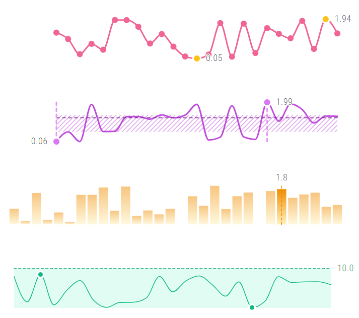
Quick Example
Let’s see how quickly we can put together a table with sparklines. We will fuss with styling and other technical details later. Hopefully, most of the complicated below is from me sticking in base R, but that way I can avoid any heated debates.
I made dataui sparklines are responsive by default which makes usage in a table much more friendly.
# this is a very ugly way of creating a data.frame with lists
df1 <- data.frame(
  Group = LETTERS[1:5],
  Line =- NA,
  Bar = NA,
  stringsAsFactors = FALSE # I know 4.0 means no more of this
)
df1$Line <- lapply(1:5, function(x) list(runif(30)))
df1$Bar <- lapply(1:5, function(x) list(rnorm(40, mean = x, sd = 2)))

# to use same x scale we will calculate bins and use later
bins <- hist(unlist(df1$Bar), breaks = 20, plot = FALSE)$breaks

rt1 <- reactable(
  df1,
  columns = list(
    Line = colDef(
      # use reactable very convenient conversion of htmlwidgets
      #  we will focus on this in another article
      #  more details on custom rendering
      #  https://glin.github.io/reactable/articles/custom-rendering.html
      cell = function(value, index) {
        dui_sparkline(
          data = value[[1]], # because we gave it a list use [[1]]
          height = 80, # we will want to be specific here
          components = dui_sparklineseries()
        )
      }
    ),
    Bar = colDef(
      cell = function(value, index) {
        dui_sparkline(
          data = hist(value[[1]], breaks=bins, plot=FALSE)$density,
          height = 80,
          component = dui_sparkbarseries()
        )
      }
    )
  )
)
rt1
Where’s the Interactivity
I implied interactivity in my introduction, but that last table had none. Let’s see how we can enrich the user experience with some sparklines that show they are listening. I will just focus on the line for now, but add the same code in the bar for similar results.
# I will make the changes here to colDef so they hopefully are more clear
Line <- colDef(
  cell = function(value, index) {
    dui_sparkline(
      data = value[[1]],
      height = 80,
      components = list(
        dui_sparklineseries(),
        # interactivity added here and unstyled for now
        dui_tooltip(components = list(
          dui_sparkhorizontalrefline(),
          dui_sparkverticalrefline(),
          dui_sparkpointseries(size=6) #obnoxiously big so it is apparent
        ))
        # end of interactivity
      )
    )
  }
)
# for brevity I stored the Bar colDef as Bar <- colDef() from above
#   and hid;  hope this isn't too confusing
rt2 <- reactable(df1, columns = list(Line=Line, Bar=Bar))
rt2
If all went as planned, then those four new lines should create a crosshair (vertical and horizontal reference line) along with a point that tracks the user mouse on the chart.
But It Is Still Ugly
Yes, for a couple of lines, I am pretty pleased, but we can improve the aesthetics a bit. Again, we’ll focus on the line for now, but as before the same techniques can be applied to the bar.
We might want to change the colors. To stay in base R we can use topo.colors even though they are a little dated. If you are wondering about the colors in data-ui examples, you can see the palette here and originate here.
colpal <- topo.colors(5)

Line <- colDef(
  cell = function(value, index) {
    dui_sparkline(
      data = value[[1]],
      height = 80,
      components = list(
        dui_sparklineseries(
          # styling
          stroke = colpal[index],
          showArea = TRUE,
          fill = colpal[index]
        ),
        dui_tooltip(components = list(
          dui_sparkverticalrefline(
            #styling
            strokeDasharray = "4,4",
            stroke = gray.colors(10)[3]
          ),
          dui_sparkpointseries(
            #styling
            stroke = colpal[index],
            fill = "#fff",
            #litle extra interactivity for demostration purposes
            renderLabel = htmlwidgets::JS("(d) => d.toFixed(2)")
          )
        ))
      )
    )
  }
)
rt3 <- reactable(df1, columns = list(Line=Line, Bar=Bar))
rt3
As you likely have already figured out, I am not a designer. I’ll leave that to the professionals, but I would say not all that bad for a couple more function arguments and base R colorsets. Replicate data-ui Sparkline Examples goes into a lot more details with gradients and patterns and comes from clearly a more aesthetically minded person.
Statistical Display
data-ui also has built-in functionality for various statistics that can also be easily included, but as you know R is a little more statistical than JavaScript. I’ll calculate in R below.
colpal <- topo.colors(5)

Line <- colDef(
  cell = function(value, index) {
    dui_sparkline(
      data = value[[1]],
      height = 80,
      # make some room for our statistics
      margin = list(right = 40),
      components = list(
        dui_sparklineseries(
          stroke = colpal[index],
          showArea = TRUE,
          fill = colpal[index]
        ),
        # statistics - display median for reference
        dui_sparkhorizontalrefline(
          reference = median(value[[1]]),
          stroke = colpal[index],
          strokeDasharray = "4,4",
          renderLabel = htmlwidgets::JS("(d) => d.toFixed(2)"),
          labelPosition = "right"
        ),
        dui_tooltip(components = list(
          dui_sparkverticalrefline(
            strokeDasharray = "4,4",
            stroke = gray.colors(10)[3]
          ),
          dui_sparkpointseries(
            stroke = colpal[index],
            fill = "#fff",
            renderLabel = htmlwidgets::JS("(d) => d.toFixed(2)")
          )
        ))
      )
    )
  }
)
rt4 <- reactable(df1, columns = list(Line=Line, Bar=Bar))
rt4
Reactable Finishing Touches
reactable is based on flexbox and not the traditional <table> HTML elements. There is absolutely nothing wrong with this, but as you fool around with the reactable styling, you will likely run into some tricky problems. To start our styling effort, we will change some things like font and try a couple reactable arguments.
rt5 <- reactable(
  df1,
  fullWidth = FALSE,
  width = 600,
  compact = TRUE, # I actually like my tables even more compact than this
  striped = TRUE,
  style = list(fontFamily = "sans-serif"),
  rowStyle = list(fontSize = "1.25rem"),  # bigger text
  defaultColDef = colDef(
    # other way of css in reactable in traditional form
    headerStyle = "text-transform: uppercase; align-self: flex-end; font-weight:normal;"
  ),
  columns = list(
    Class = colDef(maxWidth = 80),
    Line = Line,
    Bar = Bar
  )
)
rt5
Where things start to unravel is if you try to align the text in the center or the end. Here is what you might get, or how can we break our table with one CSS change.
rt6 <- reactable(
  df1,
  fullWidth = FALSE,
  width = 600,
  compact = TRUE,
  style = list(fontFamily = "sans-serif"),
  rowStyle = list(
    fontSize = "1.25rem",
    # break our table
    alignItems = "center" #"flex-end" for bottom
  ),
  defaultColDef = colDef(
    headerStyle = "text-transform: uppercase; align-self: flex-end; font-weight:normal;"
  ),
  columns = list(
    Class = colDef(maxWidth = 80),
    Line = Line,
    Bar = Bar
  )
)
rt6
Everything was going so well. Now what? Fortunately, it is not as bad as it appears. If we add back our striped = TRUE, then it doesn’t seem so bad.
# not the advised way of changing back to striped
rt7 <- rt6
rt7$x$tag$attribs$striped <- TRUE
rt7
The stripes tell us that really just the borders are the problem. We could just eliminate the borders with borderless = TRUE. Or, we can add borders with a tiny change to rowStyle.
rt8 <- reactable(
  df1,
  fullWidth = FALSE,
  width = 600,
  compact = TRUE,
  style = list(fontFamily = "sans-serif"),
  # turn off borders here
  borderless = TRUE,
  rowStyle = list(
    fontSize = "1.25rem",
    alignItems = "center", #"flex-end" for bottom
    # add back border here
    borderBottom = "1px solid lightgray" # likely will want to be more specific with color
  ),
  defaultColDef = colDef(
    headerStyle = "text-transform: uppercase; align-self: flex-end; font-weight:normal;"
  ),
  columns = list(
    Class = colDef(maxWidth = 80),
    Line = Line,
    Bar = Bar
  )
)
rt8
If you are not aware, Greg Lin has put a great cookbook together for adding professional, modern polish to your reactable. Also, his Building the Twitter Followers Demo is a very helpful resource. Blend what we have learned here with those two articles and share with me and the world.
Conclusion
I gave myself 2 hours to write this, and I am already well, well past. dataui has some other helpers to eliminate some technical concerns with the far easier implementation that you see above. Namely, reactable duplicates the data in multiple places, which for small datasets doesn’t matter, but for bigger becomes much more concerning. I’ll try to write that up later.
dataui has already been a much bigger effort than I originally planned. If you have interest, please, please join in the fun. I’d love contributions of all types from all skill levels.