
micropolar Nightingale Coxcombs
As I continue my exploration of all the use cases for Polar Coordinates, I found lots of references to Florence Nightingale's coxcomb diagrams. Below is an image from Wikipedia.

I then rediscovered this nice listing of R datasets which had a detailed post on the data behind Florence Nightingale's coxcomb plot of mortality during the Crimean War.
With the new micropolar libary and rCharts, we should be able to produce an interactive d3js version. You might notice this is not exactly the same, so consider it a work in progress. However, here is how you can get close with a few lines of R code.
Get Data and Dress it Up
Thanks to the R datasets listing I discovered that there is a Nightingale dataset in the HistData package. The data is not big, but this still saved quite of bit of time.
# Thanks to the R datasets github repo
# http://vincentarelbundock.github.io/Rdatasets/doc/HistData/Nightingale.html

library(HistData)
data(Nightingale)


# transform our data to a good format for rCharts
night.df <- data.frame(
  1 : nrow(Nightingale) * 180 / nrow(Nightingale),
  # make numeric javascript date
  as.numeric(as.POSIXct(as.Date(Nightingale[,1])))*1000,
  apply(Nightingale[,8:10], MARGIN = 1, sum)
)
colnames( night.df ) <- c( "number", "date", "rate" )
night.df$regime <- c(rep('Before', 12), rep('After', 12))
night.df$month <- format(as.Date(Nightingale$Date), "%b %Y")

# For some graphs, it is more convenient to reshape death rates to long format
# we will need in this format for the staced area micropolar chart
require(reshape)
Night<- Nightingale[,c(1,8:10)]
melted <- melt(Night, "Date")
names(melted) <- c("Date", "Cause", "Deaths")
melted$Cause <- sub("\\.rate", "", melted$Cause)
melted$Regime <- ordered( rep(c(rep('Before', 12), rep('After', 12)), 3), levels=c('Before', 'After'))
Night <- melted
Night$Month <- format(Night$Date, "%b %Y")
Interactive Charts
Below is the code to generate the charts above.
require(rCharts)

make_dataset = function(data = data){
  lapply(toJSONArray2(data, json = F, names = F), unlist)
}


nightPlot <- rCharts$new()
nightPlot$setLib( path )
nightPlot$set(
  #remove [1:12] if you want Before and After to show on same plot
  data = make_dataset( night.df[1:12, c("month","rate") ] ),
  #data = make_dataset( x = "Month", y = "Deaths", subset(Night, Regime == "Before") ),
  radialDomain = c( 0, ceiling( max(night.df$rate) ) ),
  angularDomain =
    night.df$month[1:12],
    #paste0(
    #  "#!d3.time.format('%b %Y')(new Date(",
    #  subset(night.df, regime == "Before")$date[1:12],
    #  subset(Night, Regime == "Before")$Date[1:12],
    #  "))!#"),
  type = "areaChart",
  minorTicks = 0,
  radialTicksSuffix = '',
  height = 300,
  width = 300
)
cat(nightPlot$html(chartId="chart1"))
nightPlot <- rCharts$new()
nightPlot$setLib( path )
nightPlot$set(
  data = make_dataset( night.df[13:24, c("month","rate")] ),
  #data = make_dataset( x = "Month", y = "Deaths", subset(Night, Regime == "After") ),
  radialDomain = c( 0, ceiling( max(night.df$rate) ) ),
  angularDomain =
    subset(night.df, regime == "After")$month[1:12],
    #paste0(
    #  "#!d3.time.format('%b %Y')(new Date(",
    #  subset(Night, Regime == "After")$Date[1:12],
    #  "))!#"),
  type = "areaChart",
  minorTicks = 0,
  radialTicksSuffix = '',
  height = 300,
  width = 300
)
cat(nightPlot$html(chartId="chart2"))
Where is the Stack?
You might notice that we are missing the stacked area. With micropolar version 0.1.1, we can now accomplish this also.
nightPlot <- rCharts$new()
nightPlot$setLib( path )
nightPlot$templates$script = paste(getwd(),"stackedArea.html",sep="/")
nightPlot$set(
  #remove [1:12] if you want Before and After to show on same plot
  data = make_dataset( subset(Night, Regime == "Before")[,c("Month","Deaths","Cause")] ),
  radialDomain = c( 0, ceiling( max(night.df$rate) ) ),
  angularDomain =
    night.df$month[1:12],
  additionalAngularEndTick = F,
  margin = 35,
  originTheta = -90,
  radialAxisTheta = -30,
  type = "StackedAreaChart",
  minorTicks = 0,
  radialTicksSuffix = '',
  height = 300,
  width = 300
)
cat(nightPlot$html(chartId="chart3"))
nightPlot <- rCharts$new()
nightPlot$setLib( path )
nightPlot$templates$script = paste(getwd(),"stackedArea.html",sep="/")
nightPlot$set(
  #remove [1:12] if you want Before and After to show on same plot
  data = make_dataset( subset(Night, Regime == "After")[,c("Month","Deaths","Cause")] ),
  radialDomain = c( 0, ceiling( max(night.df$rate) ) ),
  angularDomain =
    night.df$month[13:24],
  additionalAngularEndTick = F,
  margin = 35,
  originTheta = -90,
  radialAxisTheta= -30,
  type = "StackedAreaChart",
  minorTicks = 0,
  radialTicksSuffix = '',
  height = 300,
  width = 300
)
cat(nightPlot$html(chartId="chart4"))
Static Versions from Rdatasets Post
As a comparison, I just copied the code from the HistData documentation which offered a couple static ggplot2 and base plots of the Nightingale data.
##### original code for reference
# For some graphs, it is more convenient to reshape death rates to long format
# keep only Date and death rates
require(reshape)
Night<- Nightingale[,c(1,8:10)]
melted <- melt(Night, "Date")
names(melted) <- c("Date", "Cause", "Deaths")
melted$Cause <- sub("\\.rate", "", melted$Cause)
melted$Regime <- ordered( rep(c(rep('Before', 12), rep('After', 12)), 3), levels=c('Before', 'After'))
Night <- melted
Night$Month <- format(Night$Date, "%b %Y")
# make numeric javascript date
#Night$Date <- as.numeric(as.POSIXct(as.Date(Night$Date)))*1000
# subsets, to facilitate separate plotting
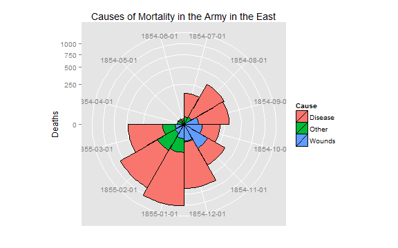
Night1 <- subset(Night, Date < as.Date("1855-04-01"))
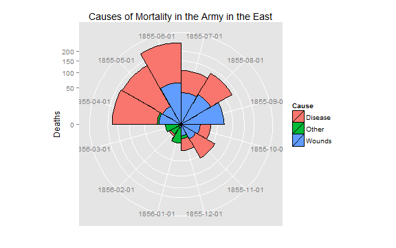
Night2 <- subset(Night, Date >= as.Date("1855-04-01"))
## Not run:
require(ggplot2)
# Before plot
cxc1 <- ggplot(Night1, aes(x = factor(Date), y=Deaths, fill = Cause)) +
# do it as a stacked bar chart first
geom_bar(width = 1, position="identity", color="black") +
# set scale so area ~ Deaths
scale_y_sqrt()
# A coxcomb plot = bar chart + polar coordinates
cxc1 + coord_polar(start=3*pi/2) +
ggtitle("Causes of Mortality in the Army in the East") +
xlab("")
# After plot
cxc2 <- ggplot(Night2, aes(x = factor(Date), y=Deaths, fill = Cause)) +
 geom_bar(width = 1, position="identity", color="black") +
 scale_y_sqrt()
cxc2 + coord_polar(start=3*pi/2) +
    ggtitle("Causes of Mortality in the Army in the East") +
    xlab("")
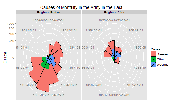
# do both together, with faceting
cxc <- ggplot(Night, aes(x = factor(Date), y=Deaths, fill = Cause)) +
 geom_bar(width = 1, position="identity", color="black") +
 scale_y_sqrt() +
 facet_grid(. ~ Regime, scales="free", labeller=label_both)
cxc + coord_polar(start=3*pi/2) +
    ggtitle("Causes of Mortality in the Army in the East") +
    xlab("")
## End(Not run)
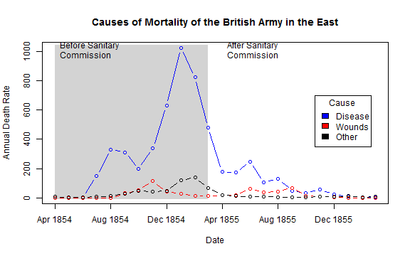
## What if she had made a set of line graphs?
colors <- c("blue", "red", "black")
with(Nightingale, {
plot(Date, Disease.rate, type="n", col="blue",
ylab="Annual Death Rate", xlab="Date", xaxt="n",
main="Causes of Mortality of the British Army in the East");
# background, to separate before, after
rect(as.Date("1854/4/1"), -10, as.Date("1855/3/1"),
1.02*max(Disease.rate), col="lightgray", border="transparent");
text( as.Date("1854/4/1"), .98*max(Disease.rate), "Before Sanitary\nCommission", pos=4);
text( as.Date("1855/4/1"), .98*max(Disease.rate), "After Sanitary\nCommission", pos=4);
# plot the data
points(Date, Disease.rate, type="b", col=colors[1]);
points(Date, Wounds.rate, type="b", col=colors[2]);
points(Date, Other.rate, type="b", col=colors[3])
}
)
# add custom Date axis and legend
axis.Date(1, at=seq(as.Date("1854/4/1"), as.Date("1856/3/1"), "4 months"), format="%b %Y")
legend(as.Date("1855/10/20"), 700, c("Disease", "Wounds", "Other"),
col=colors, fill=colors, title="Cause")
Thanks
Thanks to Chris Viau, Ramnath Vaidyanathan, and Vincent Arelbundock.