
R Lattice Plot Gets a Moving d3 y Axis
As promised, we will continue to apply more and more d3 functionality to our R exported ggplot2 and lattice graphics. The zoom behavior illustrated in ggplot2 meet d3 works best if we have d3 scales for our plot. Let's gradually build up to this proper zoom by using d3.svg.axis() to make an interactive y axis. If you would like a quick tutorial on d3 scales and axes, go to Scott Murray's scales tutorial and axes tutorial.
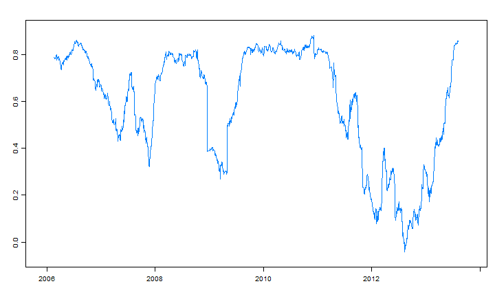
Plots are way more fun if they show something useful. As you might expect, I'll get some finance data. This will be the 90-day rolling correlation of daily returns between Pimco's Total Return Fund (PTTRX) and Pimco's All Asset All Authority Fund (PAUAX). If you prefer, you could easily substitute this data with something like the AirPassengers dataset from R. The code is flexible to accommodate this with no additional changes.
#get the latest version of gridSVG
#install.packages("gridSVG", repos="http://R-Forge.R-project.org")
require(lattice)
require(gridSVG)
require(quantmod)
require(PerformanceAnalytics)

#get Pimco Total and Pimco All Asset All Authority
pimcoTotal <- getSymbols(
  "PTTRX", from = '1990-01-01', auto.assign=FALSE)[,6]
pimcoAllAsset <- getSymbols(
  "PAUAX", from = '1990-01-01', auto.assign=FALSE)[,6]

#merge daily returns
returns <- na.omit( merge(
  ROC(pimcoTotal, n=1, type = "discrete"),
  ROC(pimcoAllAsset, n=1, type = "discrete")
))

#get rolling 90-day correlation
rollCorr <- na.omit(runCor(returns[,1],returns[,2],90))
Draw a graph with lattice xyplot of our 90-day rolling correlation of returns. We'll make it very simple, so we can focus our attention on the important elements. Once our graph is drawn, let's use grid.export("") to export the grid to SVG. Again if the rolling correlation data scares you, here is where you can sub p <- xyplot(AirPassengers in place of p <- xyplot(rollCorr.
p <- xyplot(
  rollCorr,
  scales = list( x = list(tck=c(1,0))),
  xlab = NULL
)

p

mysvg <- grid.export("")
Unlike previous posts we will not send our actual data. Instead, we will send the gridSVG coordinate translation data to Javascript as JSON. To make a nice d3.svg.axis() we will need to know the position, limits, and coordinates of the axis. Thoughtfully, the authors of gridSVG provide this by default.
cat(
  saveXML(mysvg$svg),
  '
<script>
coords =',
  toJSON(mysvg$coords),
  '
</script>'
)
We'll move into all Javascript now. We will define both a d3 scale and axis for our y.
<script>
var yScale = d3.scale.linear(),
    yAxis = d3.svg.axis(),
    yAxisCoords = coords["plot_01.toplevel.vp::plot_01.panel.1.1.vp.1"];

//in yscale we have our domain or in R-speak ylim
yScale.domain(yAxisCoords.yscale);
//then we will need the coordinates that match these limits
yScale.range([yAxisCoords.y,yAxisCoords.height+yAxisCoords.y]);

//we have a scale now that we can give our y Axis
yAxis
  .scale(yScale)
  .orient("left")
  .ticks(5);
d3 makes it very easy to draw an axis.
d3.select("#gridSVG").append("g")
    .attr("class", "yaxis")
    .attr("transform", "translate(" + yAxisCoords.x + ",0)")
    .call(yAxis);
gridSVG might mess you up if you are not aware of its use of scale(1,-1) and your text will all be upside down. To fix this, we will need to apply a transform="scale(1,-1)". While we are at it, let's also make our text black.
//gridSVG uses scale(1,-1) so we need to counteract on text
//so that it is not flipped
d3.select(".yaxis").selectAll("text")
    .attr("transform","scale(1,-1)")
    .attr("fill","black")
    .attr("fill-opacity",1)
    .attr("stroke","black")
    .attr("stroke-opacity",1)
    .text(function(d) {return d3.format("0.0%")(d)});
We will steal from our previous post to accomplish a mouseover effect. When we mouseover the chart, our new y axis will move to our mouse position. Then when we mouseout, we use d3 transition() to smoothly dock our axis in its slip.
d3.select("#gridSVG").append("rect")
    .attr("class", "overlay")
    .attr("x", d3.selectAll("defs [id*='plot_01.panel.1.1.vp.2.clipPath'] rect").attr("x"))
    .attr("y", d3.selectAll("defs [id*='plot_01.panel.1.1.vp.2.clipPath'] rect").attr("y"))
    .attr("width", d3.selectAll("defs [id*='plot_01.panel.1.1.vp.2.clipPath'] rect").attr("width"))
    .attr("height", d3.selectAll("defs [id*='plot_01.panel.1.1.vp.2.clipPath'] rect").attr("height"))
    .attr("fill", "none")
    .attr("stroke", "none")
    .attr("pointer-events","all")
    //.on("mouseover", function() { focus.style("display", null); })
    .on("mouseout", function() { d3.select(".yaxis").transition().attr("transform", "translate(" + yAxisCoords.x + ",0)") })
    .on("mousemove", mousemove);

function mousemove() {
  var x0 = d3.mouse(this)[0]
  d3.select(".yaxis").attr("transform", "translate(" + x0 + ",0)");
}
</script>
Bring on the comments and suggestions. Collective creativity will be far more expansive than my own bounded creativity.