R Financial Time Series Plotting
from plot.default to rCharts
View the Project on GitHub timelyportfolio/rCharts_time_series
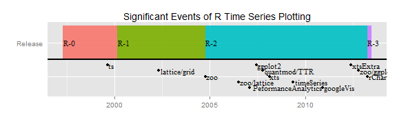
History of R Financial Time Series Plotting
As with all of R, the ability to easily chart financial time series is the result of an iterative progression driven by the collaboration of an extremely dedicated group of open source volunteers. With the release of rCharts, I thought it would be interesting to document the timeline of this progression. For each step in the timeline, I will include a link to the source code (svn or github) of the package and a minimal example to demo the "out-of-the-box" capability. In another iteration, I will explore more advanced usage of these functions. Separating the financial time series piece from graphing in general can get murky, and some of the timeline will differ from the timeline of R graphics and the timeline of R time series analysis.
For a much more extensive discussion of time series analysis with R, please see:
- Time Series Analysis with R by A. Ian McLeod, Hao Yu, and Esam Mahdi
- CRAN Task View: Time Series Analysis by Rob Hyndman
- A Little Book of R for Time Series by Avril Chohlan
Just in case you don't make it to the end,
Thanks to the contributors! I wouldn't be using R if it weren't for you.
First, to build a plot, we need data. Let's see how easy it is to get a time series of financial data in R through quantmod getSymbols(). The getSymbols() function has been a work in progress since December 20, 2006.
require(latticeExtra)
require(ggplot2)
require(reshape2)
suppressPackageStartupMessages(
  require(googleVis)
)
require(quantmod)
require(PerformanceAnalytics)
require(xtsExtra)
require(rCharts)


# get S&P 500 data from FRED (St. Louis Fed)
sp500 <- na.omit(
  getSymbols(
    "SP500",
    src = "FRED",
    from = "1949-12-31",
    auto.assign = FALSE
  )
)

# use monthly data
sp500.monthly <- sp500[endpoints(sp500, on ="months")]
Timeline
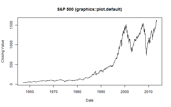
plot.default (As Old as Time Itself)
# base plot of time series prior to xts
# get the data in data.frame format rather than xts
sp500.df <- data.frame(
  index(sp500.monthly),
  coredata(sp500.monthly),
  stringsAsFactors=FALSE
)
# name columns
colnames( sp500.df ) <- c( "date", "sp500" )
# go back in time to plot.default from the graphics library
graphics::plot.default(
  x = sp500.df$date,
  y = sp500.df$sp500,
  type = "l",
  xlab = "Date",
  ylab = "Closing Value",
  main = "S&P 500 (graphics::plot.default)"
)
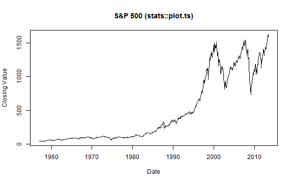
ts 1999-08-27
The ts package was added in R version 0.65.0 and significantly improved with release 1.5.0 in April 2002. There is a very good discussion of the improvements in Brian Ripley's "Time Series in R 1.5.0" from Volume 2 of R News, June 2002. plot.ts() added some nice features, such as the ability to plot multiple/wide time series, specify panels per series, and easily calculate acf, ARIMA,and HoltWinters.
stats::plot.ts(
  ts(sp500.monthly,
     start = c(
       as.numeric(format(index(sp500.monthly)[1],"%Y")),
       as.numeric(format(index(sp500.monthly)[1],"%m"))
     ),
     frequency = 12
  ), # some backwards conversion to ts from xts
  xlab = "Date",
  ylab = "Closing Value",
  main = "S&P 500 (stats::plot.ts)"
)
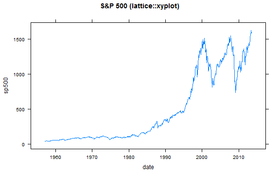
lattice and grid released with R 1.5.0 2002-04-29
R 1.5.0 was a very important milestone for both graphing and time series analysis with the release of lattice (Deepayan Sarkar) and grid (Paul Murrell) and also the improvements in ts mentioned above., All of these are covered in Volume 2 of R News, June 2002. lattice using grid as its platform began an era of aesthetically pleasing and production-quality graphics straight from R.
xyplot(
  sp500 ~ date,
  data = sp500.df,
  type = "l",
  main = "S&P 500 (lattice::xyplot)"
)
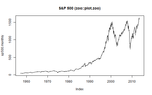
zoo 2004-10-08
zoo made it easier to work with irregular time series in R and "bridged the gap." plot.zoo() allowed us plot.ts() functionality for zoo objects.
zoo::plot.zoo(
  sp500.monthly,
  main = "S&P 500 (zoo::plot.zoo)"
)
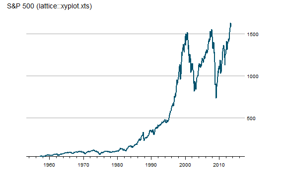
zoo Meets lattice 2006-07-06
zoo adds a very handy xyplot.zoo() function so there is no more need to convert zoo objects before accessing all the power off lattice.
# although slightly out of chronology
# I'll also use theEconomist from latticeExtra
asTheEconomist(
  xyplot(
    sp500.monthly,
    scales = list( y = list( rot = 0 ) ),
    main = "S&P 500 (lattice::xyplot.xts)"
  )
)
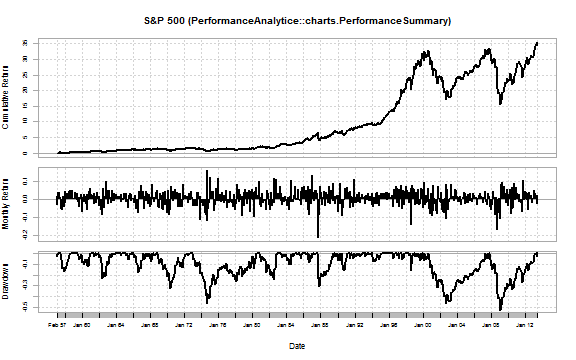
PerformanceAnalytics chart.TimeSeries 2007-02-02
PerformanceAnalytics addressed many of the graphical patterns necessary for financial performance reporting. chart.TimeSeries() and chart.BarVaR() serve as the base for functions such as the very useful charts.PerformanceSummary() below. In addition to the charts, PerformanceAnalytics adds many useful tables and makes both easy and very complicated performance calculations accessible in R. Most of the PerformanceAnalytics functions require a xts return series rather than price.
# 2007-02-02 chart.TimeSeries in PerformanceAnalytics
charts.PerformanceSummary(
  ROC(sp500.monthly, n = 1, type = "discrete"),
  main = "S&P 500 (PerformanceAnalytice::charts.PerformanceSummary)"
)
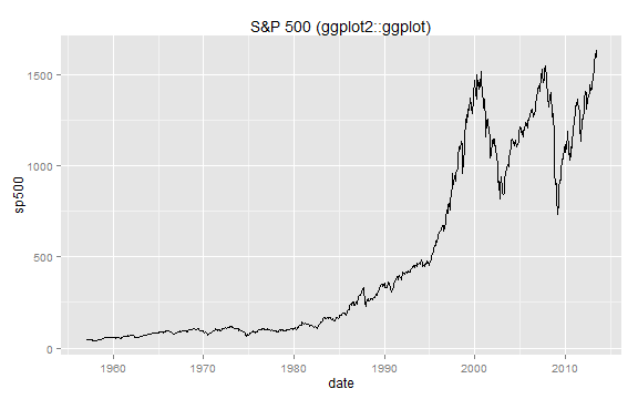
ggplot2 2007-06-10
Hadley Wickham's 2005 original ggplot was significant, but the 2007 rewrite into ggplot2 0.5 completely changed R graphics. Although ggplot2 is comprehensive and not designed specifically for time series plotting, I include it in the timeline due to both its significant impact on R graphics and its ability to handle dates/times on the x-axis. To use xts with ggplot2, a simple conversion to a wide or long format data.frame is necessary.
#ggplot2 requires conversion of xts to data.frame
#we will use the data.frame from the plot.default example
ggplot( sp500.df, aes(date) ) +
  geom_line( aes( y = sp500 ) ) +
  labs( title = "S&P 500 (ggplot2::ggplot)")
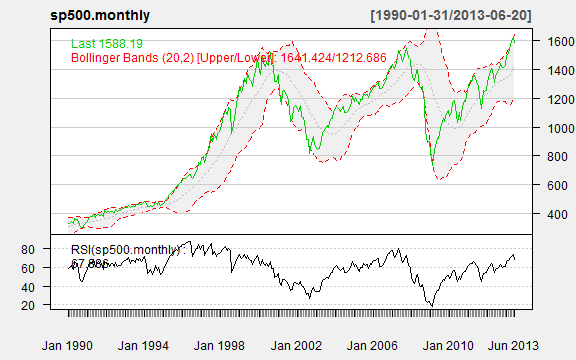
quantmod/TTR chartSeries 2007-10-07
quantmod and TTR were designed to give R technical analysis tools and calculations. The chartSeries() function makes OHLC, candlesticks, and bars charts of prices easy. Adding technical analysis, such as Bollinger Bands, RSI, MACD, becomes a couple letter function.
chartSeries(
  sp500.monthly,
  theme = chartTheme("white"),
  TA = c(addBBands(),addTA(RSI(sp500.monthly)))
)
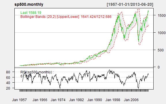
Just look how easy it is to zoom.
# also easy zooming
zoomChart("1990::")
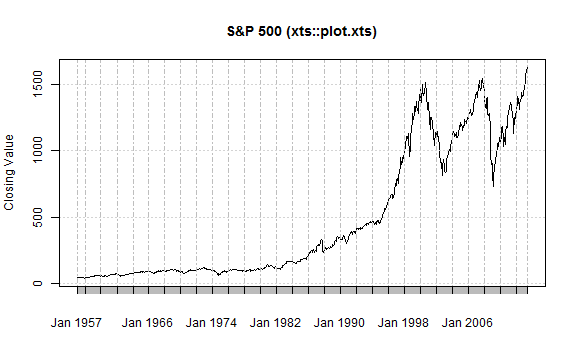
xts plot.xts 2008-02-17
In 2008, despite the various time series options in R, the world of finance demanded more and Jeff Ryan and Joshua Ulrich responded with xts. I strongly recommend reading the xts vignette to understand the benefits of xts. It is now the standard for financial time series in R. xts ported plot.zoo() to its own plot() method. A xyplot.xts() was also provided for use with lattice.
# 2008-02-17 xts improved zoo and other time series libraries
# http://cran.r-project.org/web/packages/xts/vignettes/xts.pdf
# plot.zoo got ported to plot.xts and little graphing improvement
xts::plot.xts(
  sp500.monthly,
  ylab = "Closing Value",
  main = "S&P 500 (xts::plot.xts)"
)
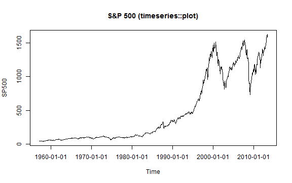
timeSeries plot 2009-05-17
The timeSeries plot() method is basically a port of R's plot.ts(). It does not significantly add any plotting functionality, but I include it for completeness and since the Rmetrics team offers robust financial analysis through its many R packages that depend on the timeSeries object.
require(timeSeries)
timeSeries::plot(
  timeSeries(sp500.monthly),
  main = "S&P 500 (timeseries::plot)"
)
googleVis 2010-11-30 and source
googleVis adds accessible interactivity to charts using Google Charts. There are a variety of chart types along with very nice animation/storyboard options.
g1 <- gvisLineChart(
  data = sp500.df,
  xvar = "date",
  yvar = "sp500",
  options = list(
    title = "S&P 500 (googleVis::gvisLineChart)",
    height = 400,
    width = 600
  )
)
print(g1,"chart")
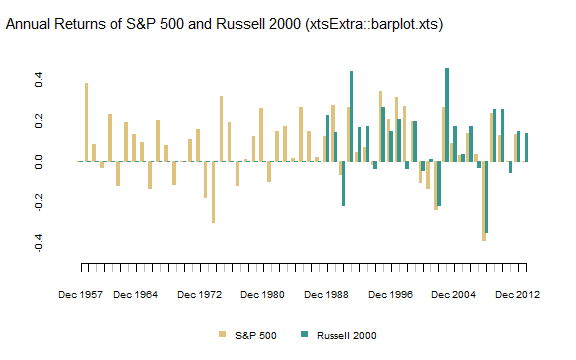
xtsExtra plot.xts and barplot.xts 2012-05-30
The Summer 2012 Google Summer of Code project xtsExtra by Michael Weylandt sought to improve the xts plotting methods as described well in Michael's announcement to R-Sig-Finance.
# lots of examples in this post
# http://timelyportfolio.blogspot.com/search/label/plot.xts

#explore barplot.xts to do a chart of annual returns for both indexes
#merge prices
russell2000 <- getSymbols("^RUT", from = "1900-01-01", auto.assign = F)
prices <- merge(sp500,russell2000[,4])
#use endpoints to get annual returns
returns.annual <- as.xts(
  apply(
    ROC(prices[endpoints(prices,"years")],type="discrete",n=1),
    MARGIN = 2,
    FUN = na.fill, fill = 0
  ),
  order.by = index(prices[endpoints(prices,"years")])
)
#name columns something a little more clear
colnames(returns.annual) <- c("S&P 500","Russell 2000")

barplot.xts(
  returns.annual,
  stacked=FALSE,
  box="transparent",  #get rid of box surrounding the plot
  ylim=c(-0.5,0.5),
  ylab=NA,
  border=c(brewer.pal(n=11,"BrBG")[c(4,9)]),
  col=c(brewer.pal(n=11,"BrBG")[c(4,9)])
)

title(
  main="Annual Returns of S&P 500 and Russell 2000 (xtsExtra::barplot.xts)",
  outer = TRUE,
  adj=0.05,
  font.main = 1,
  cex.main = 1.25,
  line = -2
)
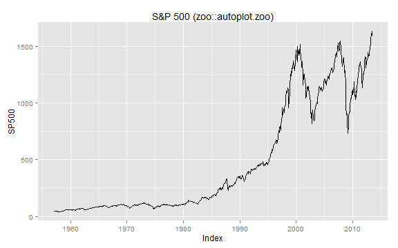
zoo meets ggplot2 with autoplot.zoo() 2012-10-14
Similar to zoo meets lattice above, autoplot.zoo() makes plotting zoo with ggplot2 much easier. As the codes shows below, xts can also use autoplot.zoo() with no explicit transformation.
autoplot.zoo(sp500.monthly) +
  ggtitle("S&P 500 (zoo::autoplot.zoo)")
rCharts 2013
Although beautiful charts were possible with all the methods above in R, good interactivity was still missing. rCharts released in 2013 by Ramnath Vaidyanathan makes interactive charts straight from R with built-in functionality from frameworks built on top of d3.js, raphael, and other leading javascript libraries. This interactivity offers a whole new level of discovery and exploration previously not available with static graphics. See the examples below. The examples are only minimal examples to demonstrate how much can be done in a few lines of code. For more thorough demos, check out the gallery.
# 2013 the world changes with rCharts

# define a function to convert xts wide to long data.frame
xtsMelt <- function(xtsData,metric){
  df <- data.frame(index(xtsData),coredata(xtsData),stringsAsFactors=FALSE)
  df.melt <- melt(df,id.vars=1)
  df.melt <- data.frame(df.melt,rep(metric,NROW(df.melt)))
  #little unnecessary housekeeping
  df.melt <- df.melt[,c(1,2,4,3)]
  colnames(df.melt) <- c("date","indexname","metric","value")
  df.melt$date <- as.Date(df.melt$date)
  #javascript works better when there are no .
  #remove troublesome . using modified method from Stack Overflow
  i <- sapply(df.melt, is.factor)
  df.melt[i] <- lapply(df.melt[i], gsub, pattern="\\.", replacement="")

  return(df.melt)
}

sp500.melt <- xtsMelt(
  sp500.monthly,
  metric = "price"
)

n1 <- nPlot(
  value~date,
  data = sp500.melt,
  group = "indexname",  # even though only one series need to specify group
  type = "lineWithFocusChart"
)

n1$xAxis(
  tickFormat=
    "#!function(d) {return d3.time.format('%b %Y')(new Date( d ));}!#"
)

n1$x2Axis(
  tickFormat=
    "#!function(d) {return d3.time.format('%Y')(new Date( d ));}!#"
)
n1$print("chart1")
morris.js example
sp500.df$date <- format(sp500.df$date, "%Y-%m-%d")
m1 <- mPlot(
  sp500 ~ date,
  data = sp500.df,
  type = "Line"
)
m1$set( pointSize = 0 )
m1$set( hideHover = "auto" )
m1$print("chart2")
rickshaw example
#get date in format that rickshaw likes
sp500.df$date <- as.double(as.POSIXct(as.Date(sp500.df$date),origin="1970-01-01"))
r1 <- Rickshaw$new()
r1$layer(
  sp500 ~ date,
  data = sp500.df,
  type = "line"
)
r1$set(
  slider = TRUE
)
r1$print("chart3")
highcharts example
#get in UTC format that works best with Highcharts
sp500.df$date <- as.numeric(
  as.POSIXct(sp500.df$date, origin="1970-01-01")
) * 1000

h1 <- hPlot(
  sp500 ~ date,
  data = sp500.df,
  type = "line"
)

h1$xAxis(type = "datetime")
h1$chart(zoomType = "x")

h1$plotOptions(
  line = list(
    marker = list(enabled = F)
  )
)

h1$print("chart5")
Thanks
Thanks to all the wonderful and diligent contributors who have made R great.