Palette of Colors from Image %>% ggplot2 %>% rCharts + dimple.js
The five purposes of this post/experiment are not really related, but I figured it would be an interesting challenge to combine them.
- Highlight the great blog MetaEvoPhyloEcoOmics from Russell Dinnage
- Explore the new world of color in R provided by Jo-Fai Chow through
rPlotter - Continue Experimenting with
magrittr - Examine
ggplot_buildas proposed by Carson Sievert in Visualizing ggplot2 internals with shiny and D3 - Test the use of alternate colors in
rChartsanddimple.js
Color From Image
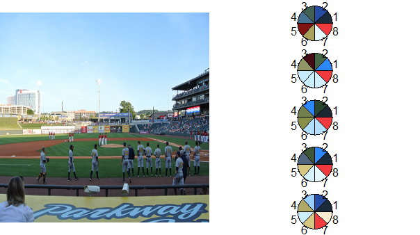
In the MetaEvoPhyloEcoOmics blog post Colourful Ecology Part 1: Selecting colours for scientific figures from an image using community ecology methods, we learn how to use rPlotter from Jo-Fai Chow to get color palettes from an image in R. The code below is almost an exact copy except I use a little magrittr and instead choose an image from a recent Birmingham Barons Minor League Baseball game for my color seed.
# attribution belongs to
# the wonderful blog www.mepheoscience.com
# Colourful Ecology Part 1
# with solid contributions from Jo-Fai Chow
# http://blenditbayes.blogspot.co.uk/2014/05/towards-yet-another-r-colour-palette.html
# https://github.com/woobe/rPlotter

# to get started we will need
# devtools::install_github("woobe/rPlotter")

library(rPlotter)
library(magrittr)

## get 5 best 6 colour palettes for MPD
## code copied almost exactly from www.mepheoscience.com
## only change is to use magrittr in pieces
"https://farm6.staticflickr.com/5153/14226682300_849ec58f3f_d.jpg" %T>%
  assign("path",.,pos=globalenv()) %>%
  extract_colours(256, 200) %>%
  mpd_select_colours(
    sat.thresh = 0.3
    , dark.thresh = 0.1
    , ncolours = 8
    , nreturn = 5
  ) -> newpal

## plot palettes
photo <- readImage( path )
h <- split.screen(c(1,2))
par(mar = c(0,0,0,0)) # set zero margins on all 4 sides
plot(x = NULL, y = NULL, xlim = c(0,1500), ylim = c(0,1500), pch = '',
     xaxt = 'n', yaxt = 'n', xlab = '', ylab = '', xaxs = 'i', yaxs = 'i',
     bty = 'n', asp=1) # plot empty figure
rasterImage(photo, xleft = 0, ybottom = 0, xright = 1500, ytop = 1500) # plot jpeg
screen(2)
par(mar=c(0,0,0,0))
h <- split.screen(c(5,1))
for (i in 1:length(newpal)) {
  screen(2+i)
  pie(rep(1, length(newpal[[i]])), col = newpal[[i]])
}
ggplot2 Does Everything But the Plotting
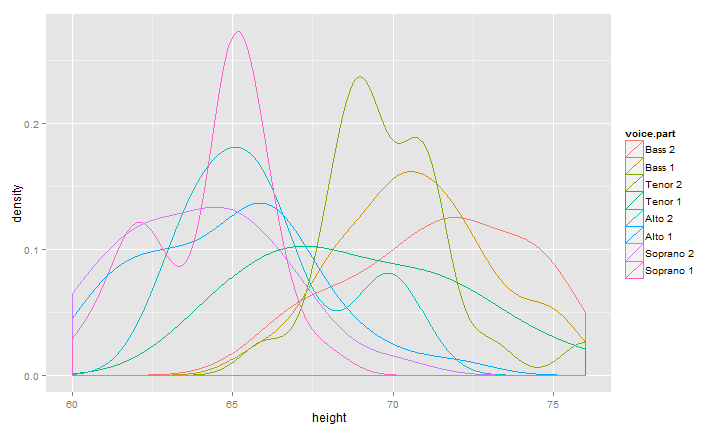
I discussed in my post I Want ggplot2/lattice and d3 (gridSVG–The Glue) what I thought were the three types of glue between R and interactive graphics. When I read Carson Sievert's post Visualizing ggplot2 internals with shiny and D3, I realized there is a 4th glue that combines 1 & 2. In this next bit of code, we'll build a ggplot2 density plot (for fun from the lattice documentation) and pass the data into rCharts to plot with dimple.js. Then to tie it together, we will use our new color palette from above. You might notice a little bit of afterScript that helps solve a minor axis issue that bothers me with dimple.js.
# combine lattice docs example with ggplot2 for sample density plot
# use chains from magrittr as a continuation of experiment
library(dplyr)
library(rCharts)

singer %>%
  ggplot( data = ., aes( x = height, colour = voice.part ) ) %>%
    + geom_density() %T>% print %>%
  ggplot_build %>% extract2(1) %>% extract2(1) %>%
  mutate( "voice.part" = levels(singer$voice.part)[group], "x" = round(x,2) ) %>%
  select( x, density, voice.part ) %>%
  dPlot(
    data = .
    , y = "density"
    , x = "x"
    , groups = "voice.part"
    , type = "line"
    , height = 400
    , width = 600
    , yAxis = list(outputFormat = ".1%")
  ) %T>%
  .$set(defaultColors = newpal[[5]]) %T>%
  .$setTemplate(afterScript = "
<script>
{{chartId}}[0].axes[0].shapes.call(
  d3.svg.axis()
    .orient('bottom')
    .scale(d3.scale.linear()
      .range(d3.extent({{chartId}}[0].axes[0]._scale.range()))
      .domain(d3.extent(
        {{chartId}}[0].axes[0]._scale.domain()
          .splice(0,{{chartId}}[0].axes[0]._scale.domain().length-1))
      )
    )
    .ticks(5)
 )
{{chartId}}[0].svg.append('text')
  .style('font-size','150%')
  .attr('x',20)
  .attr('y',20)
  .text('rCharts + dimple.js with ggplot2 data')
</script>
") -> dp