Multiple Lines gridSVG and d3
View the Project on GitHub timelyportfolio/gridSVG_d3_multline
As another post in the series, I thought I would show an alternate way of using d3 to bind data from a gridSVG exported lattice plot. This time we will have multiple strips complicating our data bind. Also, I will use a different set of techniques to send the data from R to Javascript. I think I prefer how I have done it previous posts though. No sense in wasting time with the intro. Let's grab US Treasury Yield Curve data from the Federal Reserve Bank of St. Louis FRED.
FRED, Give Us Some Treasury Yield Data
We will get the daily yield series for US Treasuries with 1, 2, 3, 5, 7, 10, 20, and 30 year maturities.
require(quantmod)
require(rCharts)
#now get the US bonds from FRED
USbondssymbols <- paste0("DGS",c(1,2,3,5,7,10,20,30))

ust.xts <- xts()
for (i in 1:length( USbondssymbols ) ) {
  ust.xts <- merge(
    ust.xts,
    getSymbols(
      USbondssymbols[i], auto.assign = FALSE,src = "FRED"
    )
  )
}
ust.xts <- na.omit(ust.xts)

xtsMelt <- function(data) {
  require(reshape2)

  #translate xts to time series to json with date and data
  #for this behavior will be more generic than the original
  #data will not be transformed, so template.rmd will be changed to reflect


  #convert to data frame
  data.df <- data.frame(
    cbind(format(index(data),"%Y-%m-%d"),coredata(data))
  )
  colnames(data.df)[1] = "date"
  data.melt <- melt(data.df,id.vars=1,stringsAsFactors=FALSE)
  colnames(data.melt) <- c("date","indexname","value")
  #remove periods from indexnames to prevent javascript confusion
  #these . usually come from spaces in the colnames when melted
  data.melt[,"indexname"] <- apply(
    matrix(data.melt[,"indexname"]),
    2,gsub,pattern="[.]",replacement=""
  )
  return(data.melt)
  #return(df2json(na.omit(data.melt)))
}

ust.melt <- xtsMelt( ust.xts["2012::",] )

ust.melt$date <- as.Date(ust.melt$date)
ust.melt$value <- as.numeric(ust.melt$value)
ust.melt$indexname <- factor(
  ust.melt$indexname, levels = colnames(ust.xts)
)
ust.melt$maturity <- as.numeric(
  substr(
    ust.melt$indexname, 4, length( ust.melt$indexname ) - 4
  )
)
ust.melt$country <- rep( "US", nrow( ust.melt ))
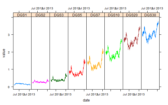
Draw A Graph with Lattice
This graph could be much prettier, but to limit the amount of code I will settle for this uglier version.
require(latticeExtra)

p1 <- xyplot(
  value ~ date | indexname,
  groups = indexname,
  data =  ust.melt,
  type = "l",
  scales = list(
    x = list(
      at = pretty(ust.melt$date,n=3)[c(1,3)],
      format = "%b %Y"
    )),
  layout = c(8,1)
)
p1

We will exploit grid.export() magic to export our graph to SVG.
p1
require(rjson)
require(gridSVG)

#export our lattice chart
exportlist <- grid.export("", addClasses = TRUE )
d3 Reverse Data Bind
Even though I don't like it as much, here is my original solution to sending data from R to javascript. You will probably notice that it requires much more R and javascript code to tidy and bind. This will result in data that looks something like this.

#set up a function to pull the groups
#which lattice calls subscripts
#use with lapply
#l is the
getgroup <- function(l,p) {
  return(p$panel.args.common$groups[l$subscripts])
}

#set up a function to get the data and add groups
#in one list so we can pass as json
#accepts a trellis object as p
getlist <- function(p) {
  data <- p$panel.args

  #use the getgroup function to get groups
  #lattice places the groups in subscripts
  #in the panel.args.common list
  groups <- lapply(
    data,
    FUN=getgroup,
    p=p
  )

  for ( i in 1:length(data) ) {
    data[[i]]$groups <- groups[[i]]
  }

  names(data) <- unlist(p$condlevels)

  return(
    list(
      strips = p$condlevels,
      groups = unique(unlist(groups)),
      data = data
    )
  )
}

#use our fancy function from above to get
#all the data we will need to reverse data bind with d3
data <- rjson::toJSON( getlist( p1 ) )
cat('
<script>
data =
', data)
The d3 reverse data bind portion of the javascript will look like this. We will loop through each of the keys (strips in lattice-speak) in the data. With each key, it will parse the points from the R/gridSVG line pointsToArray(d3.select(g[0][i]).select('polyline').attr("points")). We will add x,y,group, and strip to our new pointsdata array.
var pointsdata = [];
var pointsline = [];
d3.entries(data.data).forEach(
  function (d,i) {
    pointsline = pointsToArray(d3.select(g[0][i]).select('polyline').attr("points"));
    d.value.groups.forEach(
      function (dd, ii) {
        pointsdata.push(
           {
              x:pointsline[ii].x, y:pointsline[ii].y,
              data: {"x": d.value.x[ii],
                     "y": d.value.y[ii],
                     "group": d.value.groups[ii],
                     "strip": d.key }
           }
        )
      }
    )
  }
)


//assign data to the line
g.data(d3.nest().key(function (d) {
  return d.data.group
}).entries(pointsdata));
Once we have the data in bindable form and the points parsed, we can draw a path with d3. For now, I will make the stroke white, so that we can see our added paths.
//loop through each polyline and add a path to contain the data for tootips/hover
g[0].forEach(function(d) {
  var mypath = d3.select(d).append("path")
  mypath
    .datum(mypath.datum().values)
    .attr("d",line)
    .attr("stroke","white")
})
As usual, we can do lots of things with bound data. We'll build a little on R/gridSVG/d3 Line Reverse Data Bind by adding a similar mouseover, but this time for each of the lines. I also wanted to test if adding the yield curve would be helpful. Of course, this is a rough sketch and could be improved greatly by some simple styling. I'll leave that to you.
