
gridSVG Data Binding with a Lattice Line
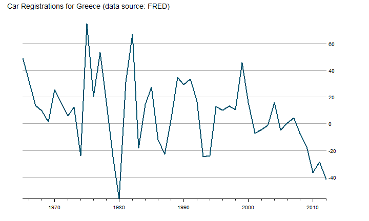
In I Want ggplot2/lattice and d3 (gridSVG–The Glue) I demonstrated a trick I call "a d3 reverse data bind" on a ggplot2 scatterplot graph. I discovered that lines are slightly more difficult to reverse data bind with d3. As an example of how this can be done without d3, see Paul Murrell's example. Let's look at the extra steps needed to make it happen on a line chart from the OECD data recently added to FRED. Retail Trade Sales: Passenger Car Registrations for Greece (SLRTCR03GRA657S) seems like something interesting.
#get the latest version of gridSVG
#install.packages("gridSVG", repos="http://R-Forge.R-project.org")

require(latticeExtra)
require(gridSVG)
require(quantmod)

#get data from FRED
greekCars <- na.omit(
  getSymbols("SLRTCR03GRA657S", src="FRED", auto.assign=F)
)
Draw Our Line Graph with Lattice
Let's use lattice this time instead of ggplot2. We will draw a basic line graph to keep it simple.
p1 <- xyplot(
  greekCars,
  par.settings = theEconomist.theme(
    box = "transparent"
  ),
  lattice.options = theEconomist.opts(),
  scales = list(y = list(rot=0)),
  xlab = NULL,
  main = "Car Registrations for Greece (data source: FRED) "
)
p1
Export to SVG
Now that we have our graph, we will need to export it to SVG with grid.export. When we supply NULL or "" to grid.export, we can get the SVG without saving as a file.
p1
oursvg <- grid.export("")

cat(saveXML(oursvg$svg))
Watch This Reverse Data Bind
The interactivity you see in the chart above does not just happen. We have to work a little for it. If we look at our line from the SVG, we see something like this.
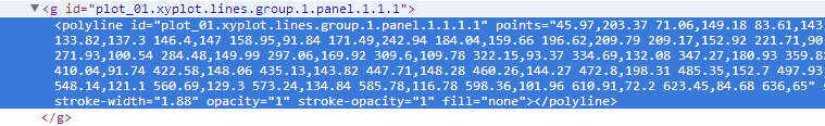
So we have our line, and the points are attributes which we can see by using d3.
d3.select("[id*='xyplot.lines']").select("polyline").attr("points")
On the scatter plot, each point was its own little SVG element, and our data could be bound directly to it. To bind data to our line, I can think of three methods.
- Let lattice draw points that we bind and make invisible with d3.
- Use d3 to create a new path/line
- Use d3 to create new points
I think the d3 new path/line method is more interesting, so I'll choose that route. We will need to split the long string of points into separate coordinates. I wrote a function (please don't be too critical) to do this and also add our R data while we are at it.
function pointsToArray(points, data) {
  var pointsArray = new Array();

  pointsArray = points.match(/[^ ]+/g);

  pointsArray = pointsArray.map(
                function (d, i) {
                  return {
                    x: d.split(",")[0],
                    y: d.split(",")[1],
                    data: data[i].value
                  }
                }
            );

  return pointsArray;
}
We will need to get the data from our R lattice plot. I will eventually make this into a function. The data for lattice plots falls into the panel.args.
cat('<script> ourdata=',
  rjson::toJSON(
    apply(
      data.frame(p1$panel.args),
      MARGIN=1,FUN=function(x)return(list(x))
    )
  ),
  '</script>'
)
Use the same code from our ggplot2 scatter post to get our data in bindable format. This bit of code translates our array of arrays of objects into an array of objects. d3 finds this much more palatable.
cat(
  '<script> dataToBind = ',
  'd3.entries(ourdata.map(function(d,i) {return d[0]}))',
  '</script>'
)
Then we will use d3.svg.line() to draw an overlay line with the points and data from our function. The interpolate("linear") will insure that the lines matches exactly. If you feel like experimenting, try interpolate("basis") to see the difference. We will also specify `attr("stroke","white") so that we will see our new line. However, in future posts I most likely will make our line invisible.
var svg = d3.select("#gridSVG");
var line = d3.svg.line()
            .x(function (d) { return +d.x; })
            .y(function (d) { return +d.y; })
            .interpolate("linear");
var g = d3.select("[id*='xyplot.lines']")

g.append("path")
  .datum(pointsToArray(g.select("polyline").attr("points"), dataToBind))
  .attr("d", line)
  .attr("stroke","white");
With a d3 data-bound line, we can do things like the mouseover in this example from Mike Bostock. Let's grab the code and make some minor adjustments to achieve this. Set up some SVG elements to house our tooltip.
var focus = svg.append("g")
    .attr("class", "focus")
    .style("display", "none")
    .attr("stroke","rgb(0,82,109)");

focus.append("circle")
    .attr("r", 4.5);

focus.append("text")
    .attr("id","focusx")
    .attr("x", 9)
    .attr("dy", ".35em")
    .attr("font-size",12)
    .attr("font-color","black")
    .attr("fill","rgb(0,82,109)")
    .attr("fill-opacity",1)
    .attr("stroke","rgb(0,82,109)")
    .attr("transform","scale(1,-1)");

focus.append("text")
    .attr("id","focusy")
    .attr("x", 9)
    .attr("y",14)
    .attr("dy", ".35em")
    .attr("font-size",12)
    .attr("fill-opacity",1)
    .attr("transform","scale(1,-1)");
Set up a SVG rectangle to pick up mouse events.
svg.append("rect")
    .attr("class", "overlay")
    .attr("x", d3.selectAll("defs [id*='plot_01.panel.1.1.vp.2.clipPath'] rect").attr("x"))
    .attr("y", d3.selectAll("defs [id*='plot_01.panel.1.1.vp.2.clipPath'] rect").attr("y"))
    .attr("width", d3.selectAll("defs [id*='plot_01.panel.1.1.vp.2.clipPath'] rect").attr("width"))
    .attr("height", d3.selectAll("defs [id*='plot_01.panel.1.1.vp.2.clipPath'] rect").attr("height"))
    .attr("fill", "none")
    .attr("stroke", "none")
    .attr("pointer-events","all")
    .on("mouseover", function() { focus.style("display", null); })
    .on("mouseout", function() { focus.style("display", "none"); })
    .on("mousemove", mousemove);
Use d3's d3.bisector to determine the position of our mouse and translate this position to the appropriate point and data. We will then move our focus element created above to the found point. Also, since we have d3 we will use its d3.format to give us percent number, and our color will change based on a negative or positive value.
var bisectX = d3.bisector(function (d) { return +d.x; }).left;

function mousemove() {
  var x0 = d3.mouse(this)[0];
  var i = bisectX( g.select("path").datum(), x0, 1);
  var d;
  d = g.select("path").datum()[i];
  focus.attr("transform", "translate(" + d.x + "," + d.y + ")");
  focus.select("#focusx")
    .text(d.data.value.x);
  focus.select("#focusy")
    .text(d3.format(".2%")(+d.data.value.y/100))
    .attr("fill",+d.data.value.y>0?"black":"red")
    .attr("stroke",+d.data.value.y>0?"black":"red");
}
I promise we will soon start to take fuller advantage of d3's expansive capablities. This post will help to make sure we have the basics covered. As I stated in the last post, this still should be considered experimental and not best practice. Please let me know if you have any suggestions.